
#7D331A Hex Color
Online color picker to view shades, tints, color codes, and complementary colors
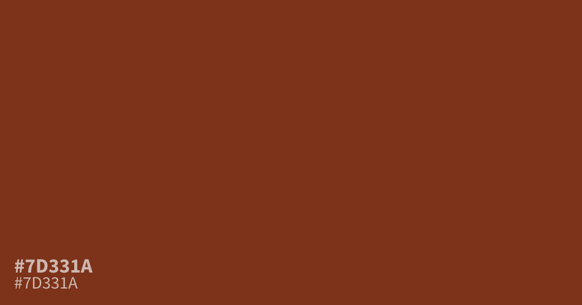
A dark, muted red with brown undertones, #7d331a creates a serious, moody presence. Its low lightness suits autumn palettes, wine branding, luxury packaging, and formal layouts, while pale cream or dusty blue adds useful contrast. Use the hex code #7d331a as a supporting tone or accent; white text reads clearly for accessible body copy.
Questions about #7d331a
What is #7d331a in RGB, HSL and CMYK?
In RGB, #7d331a is rgb(125, 51, 26), in HSL hsl(15, 66%, 30%) and in CMYK 0%, 59%, 79%, 51%. Browse more shades of brown with names and hex codes.
What colors pair well with #7d331a?
Pale cream, dusty blue, warm beige, and muted olive pair well with #7d331a by balancing its dark, brown-red base with lighter or cooler contrast without overpowering its muted, earthy character. Use cream for softer layouts and dusty blue for sharper contrast.
Does #7d331a read as warm or cool?
#7d331a reads as a warm color because its red base is shifted toward brown, creating an earthy, grounded impression rather than the crisp feel associated with blue-based reds or cool purples. Its low lightness reinforces the serious, moody effect.
Where does #7d331a work well?
#7d331a works well as a supporting tone or accent in autumn palettes, wine-related branding, luxury packaging, editorial layouts, and formal interfaces where its dark, muted warmth can add weight without demanding the whole visual field.
Is #7d331a readable on white or black?
#7d331a has a 8.89:1 contrast ratio on white and 2.36:1 on black. WCAG asks for 4.5:1 for body text and 3:1 for large text, so on white it works for body text and on black it is too faint for text. Try other pairs in the contrast checker.