
#7B739B Hex Color
Online color picker to view shades, tints, color codes, and complementary colors
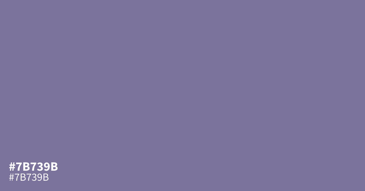
This bleak, dusty violet sits firmly in the cool range with significant gray desaturation. Because of its muted character, #7b739b works best as a supporting background element rather than a dominant primary color. Pair it with crisp black text to maintain legibility. It offers enough contrast for standard body copy, making it a reliable, understated choice for professional interface design.
Questions about #7b739b
What is #7b739b in RGB, HSL and CMYK?
In RGB, #7b739b is rgb(123, 115, 155), in HSL hsl(252, 17%, 53%) and in CMYK 21%, 26%, 0%, 39%. Browse more shades of purple with names and hex codes.
Does #7b739b work well as a primary interface color?
#7b739b is best utilized as a secondary or background element rather than a primary focus. Because it is highly desaturated, it effectively grounds a UI design without competing for attention, especially when paired with strong, dark neutral typography for essential readability.
What colors pair well with #7b739b for a balanced palette?
This color pairs beautifully with charcoal or deep, near-black tones to maintain contrast and legibility. For softer combinations, consider muted creams or light, desaturated grays, which allow the dusty violet nature of #7b739b to remain the focal point without clashing.
Is #7b739b readable on white or black?
#7b739b has a 4.40:1 contrast ratio on white and 4.76:1 on black. WCAG asks for 4.5:1 for body text and 3:1 for large text, so on white it works only for large text (24px, or 18.5px bold) and on black it works for body text. Try other pairs in the contrast checker.