
#7B6D89 Hex Color
Online color picker to view shades, tints, color codes, and complementary colors
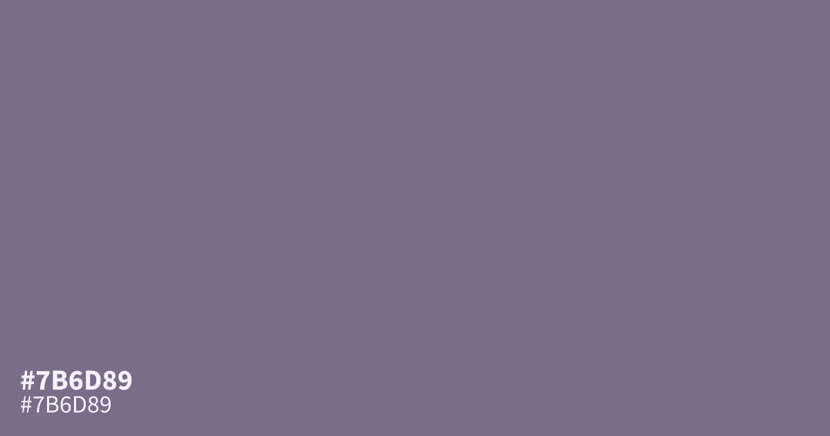
#7b6d89 is a muted, ashy purple with a matte finish and balanced gray undertones. Its restrained saturation gives layouts a calm, structured feel, making it useful as a supporting tone in luxury, spiritual, or creative branding. Pair it with warm cream or deep wine. White text provides about 4.8:1 contrast, enough for WCAG AA body text. The hex code for this shade is #7b6d89.
Questions about #7b6d89
What is #7b6d89 in RGB, HSL and CMYK?
In RGB, #7b6d89 is rgb(123, 109, 137), in HSL hsl(270, 11%, 48%) and in CMYK 10%, 20%, 0%, 46%. Browse more shades of purple with names and hex codes.
What colors pair well with #7b6d89?
The #7b6d89 hex color pairs well with warm cream for gentle contrast, deep wine for a richer palette, and muted neutrals that preserve its calm, ashy character. These combinations work well in branding, editorial layouts, and quiet interface accents.
Does #7b6d89 look warm or cool?
#7b6d89 reads as a cool, muted purple because its balanced gray undertones temper the color and keep it from feeling strongly red or warm, while its low saturation creates a soft, ashy appearance. It suits calm, structured designs.
Is #7b6d89 readable on white or black?
#7b6d89 has a 4.78:1 contrast ratio on white and 4.39:1 on black. WCAG asks for 4.5:1 for body text and 3:1 for large text, so on white it works for body text and on black it works only for large text (24px, or 18.5px bold). Try other pairs in the contrast checker.