
#7B221E Hex Color
Darker than wine, warmer than brick
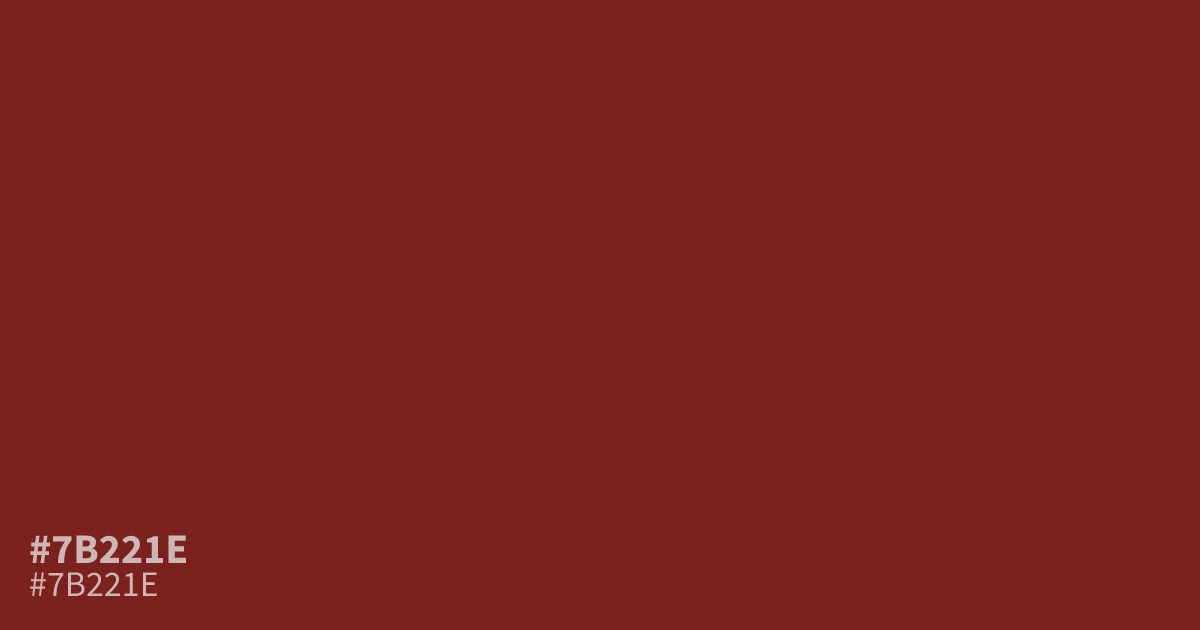
Close to oxblood, #7b221e is a dark maroon with a muted, earthy warmth. Its low brightness gives it a serious, moody feel that suits wine labels and autumn layouts. Let it act as the dominant base and add cream or dusty rose accents, since mid-toned greens can make it read muddy. The hex code also holds about 10:1 contrast with white text, so small type stays readable.
Questions about #7b221e
What is #7b221e in RGB, HSL and CMYK?
In RGB, #7b221e is rgb(123, 34, 30), in HSL hsl(3, 61%, 30%) and in CMYK 0%, 72%, 76%, 52%. Browse more shades of red with names and hex codes.
What text color works best on #7b221e?
White text is the safest choice, reaching roughly 10:1 contrast, well above the WCAG AA minimum of 4.5:1 for body text. Dark text on #7b221e fails contrast checks, so keep all type light.
What colors pair well with #7b221e?
Cream, dusty rose, and soft camel flatter #7b221e without fighting its warmth. For a stronger split, use a muted sage or slate blue as a supporting tone.
Is #7b221e readable on white or black?
#7b221e has a 10.04:1 contrast ratio on white and 2.08:1 on black. WCAG asks for 4.5:1 for body text and 3:1 for large text, so on white it works for body text and on black it is too faint for text. Try other pairs in the contrast checker.