
#7B1DB4 Hex Color
Online color picker to view shades, tints, color codes, and complementary colors
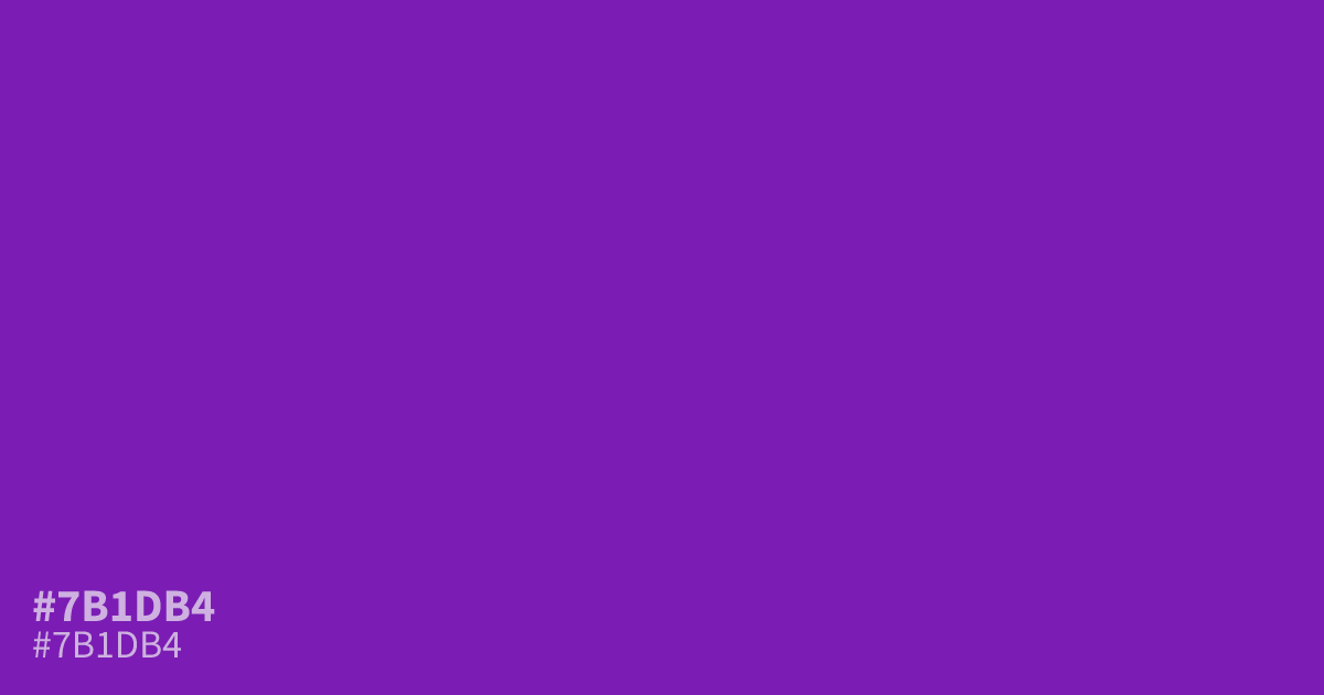
Vivid violet, heavy on saturation. #7b1db4 sits dark enough to carry white text at about 7.8:1 contrast, so it holds up behind small body copy, not just large headlines. Best spent as an accent or call-to-action color; across full backgrounds it reads loud fast. It warms up nicely against muted golds and soft peaches.
Questions about #7b1db4
What is #7b1db4 in RGB, HSL and CMYK?
In RGB, #7b1db4 is rgb(123, 29, 180), in HSL hsl(277, 72%, 41%) and in CMYK 32%, 84%, 0%, 29%. Browse more shades of purple with names and hex codes.
What colors pair well with #7b1db4?
Muted golds, soft peaches, and warm grays all flatter #7b1db4, taking the edge off its intensity. For sharper contrast, use pale apricot instead of plain white. Charcoal also works for moody, low-key palettes.
Does #7b1db4 read warm or cool?
Cool. Its blue-leaning base keeps it on the cold side of purple, which suits moody interfaces and night-themed designs. Warm accents like amber balance that chill.
Is #7b1db4 readable on white or black?
#7b1db4 has a 7.84:1 contrast ratio on white and 2.67:1 on black. WCAG asks for 4.5:1 for body text and 3:1 for large text, so on white it works for body text and on black it is too faint for text. Try other pairs in the contrast checker.