
#7B0C87 Hex Color
Deep Purple With a Moody Edge
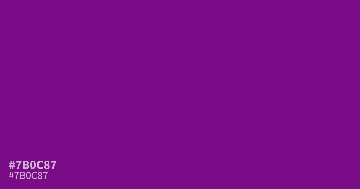
Not a soft lavender or a muted plum, #7b0c87 is a dark purple with a cool, bluish undertone. Its low lightness gives it a moody, serious feel that suits luxury packaging, wine labels, and gaming UI. Use it as a dominant base with light accents, since white text passes AA against it at about 9.4:1 contrast.
Questions about #7b0c87
What is #7b0c87 in RGB, HSL and CMYK?
In RGB, #7b0c87 is rgb(123, 12, 135), in HSL hsl(294, 84%, 29%) and in CMYK 9%, 91%, 0%, 47%. Browse more shades of purple with names and hex codes.
What colors pair well with #7b0c87?
#7b0c87 pairs well with muted golds and dusty pinks, both of which lift its cool undertone without clashing. For a darker scheme, anchor it with plum or near-black shades.
Is #7b0c87 readable on white or black?
#7b0c87 has a 9.35:1 contrast ratio on white and 2.24:1 on black. WCAG asks for 4.5:1 for body text and 3:1 for large text, so on white it works for body text and on black it is too faint for text. Try other pairs in the contrast checker.