
#7A7AB3 Hex Color
Online color picker to view shades, tints, color codes, and complementary colors
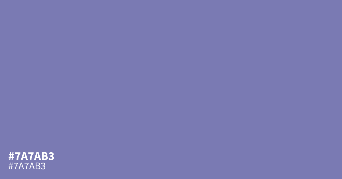
#7a7ab3 is a muted, dusty indigo with cool blue-violet undertones and a matte finish. Its low saturation gives designs a calm, understated feel suited to meditation, spiritual, luxury, and creative branding. Use it as a supporting tone beside navy or warm metallics, since it can look washed out against white. Black text has about a 5.3:1 contrast ratio on this color, meeting WCAG AA for body text. The hex code is #7a7ab3.
Questions about #7a7ab3
What is #7a7ab3 in RGB, HSL and CMYK?
In RGB, #7a7ab3 is rgb(122, 122, 179), in HSL hsl(240, 27%, 59%) and in CMYK 32%, 32%, 0%, 30%. Browse more shades of purple with names and hex codes.
What colors pair well with #7a7ab3?
#7a7ab3 pairs well with charcoal, warm brass, muted sage, and dark navy because its dusty blue-violet base needs grounded depth or restrained warmth. Charcoal supports readable layouts, while brass adds refined contrast without making the palette feel bright or playful.
Where does #7a7ab3 work best in a design?
#7a7ab3 works best as a supporting color for meditation, spiritual, luxury, and creative projects, especially in panels, secondary backgrounds, and large text. Its low saturation can feel flat across an entire interface, so pair it with darker anchors and brighter accents.
Does #7a7ab3 read as warm or cool?
#7a7ab3 reads cool because its blue-violet undertone is softened by gray and low saturation. The dusty finish keeps it from feeling icy or vivid, giving layouts a reserved mood that suits reflective themes more than energetic, high-chroma branding.
Is #7a7ab3 readable on white or black?
#7a7ab3 has a 3.99:1 contrast ratio on white and 5.26:1 on black. WCAG asks for 4.5:1 for body text and 3:1 for large text, so on white it works only for large text (24px, or 18.5px bold) and on black it works for body text. Try other pairs in the contrast checker.