
#7A6F9E Hex Color
Online color picker to view shades, tints, color codes, and complementary colors
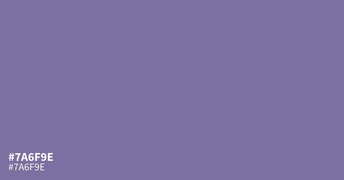
Reach for this dusty purple when a design needs a calm, grayed violet that will not shout. #7a6f9e is muted and slightly ashy, with just enough coolness to read serious. It works best as a supporting tone behind dark text, since its low saturation can turn muddy at large sizes. The hex code pairs well with warm golds and deep plums.
Questions about #7a6f9e
What is #7a6f9e in RGB, HSL and CMYK?
In RGB, #7a6f9e is rgb(122, 111, 158), in HSL hsl(254, 20%, 53%) and in CMYK 23%, 30%, 0%, 38%. Browse more shades of purple with names and hex codes.
What colors pair well with #7a6f9e?
Warm golds and deep plums bring out its violet undertone, while soft creams keep it from reading flat. Avoid pale grays, which wash out its muted character.
Is #7a6f9e readable on white or black?
#7a6f9e has a 4.57:1 contrast ratio on white and 4.59:1 on black. WCAG asks for 4.5:1 for body text and 3:1 for large text, so on white it works for body text and on black it works for body text. Try other pairs in the contrast checker.