
#7A5951 Hex Color
Online color picker to view shades, tints, color codes, and complementary colors
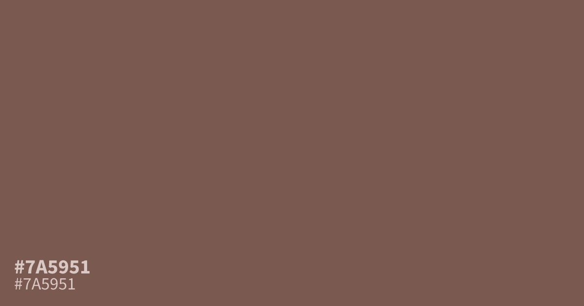
This dusty, muted red has a dark, ashy quality that leans into serious, moody territory. Because #7a5951 is so unsaturated, it works best as a grounding neutral or background element rather than a bright accent. It pairs unexpectedly well with cool slate blues, providing a sophisticated contrast. White text remains perfectly readable against this shade, making it a reliable choice for darker UI designs.
Questions about #7a5951
What is #7a5951 in RGB, HSL and CMYK?
In RGB, #7a5951 is rgb(122, 89, 81), in HSL hsl(12, 20%, 40%) and in CMYK 0%, 27%, 34%, 52%. Browse more shades of brown with names and hex codes.
How does #7a5951 function in UI design?
#7a5951 acts as an excellent grounding neutral that supports high-contrast white text, making it a reliable choice for dark mode interfaces. Because it lacks harsh saturation, it avoids overwhelming the user while providing a sophisticated, serious backdrop for content.
Which colors pair well with #7a5951?
Cool tones like slate blue or a soft cream offer the most striking visual contrast against the ashy warmth of #7a5951. These pairings emphasize the desaturated, moody nature of the color, allowing you to build balanced palettes without adding unnecessary visual clutter.
Is #7a5951 readable on white or black?
#7a5951 has a 6.22:1 contrast ratio on white and 3.37:1 on black. WCAG asks for 4.5:1 for body text and 3:1 for large text, so on white it works for body text and on black it works only for large text (24px, or 18.5px bold). Try other pairs in the contrast checker.