
#7A1658 Hex Color
Online color picker to view shades, tints, color codes, and complementary colors
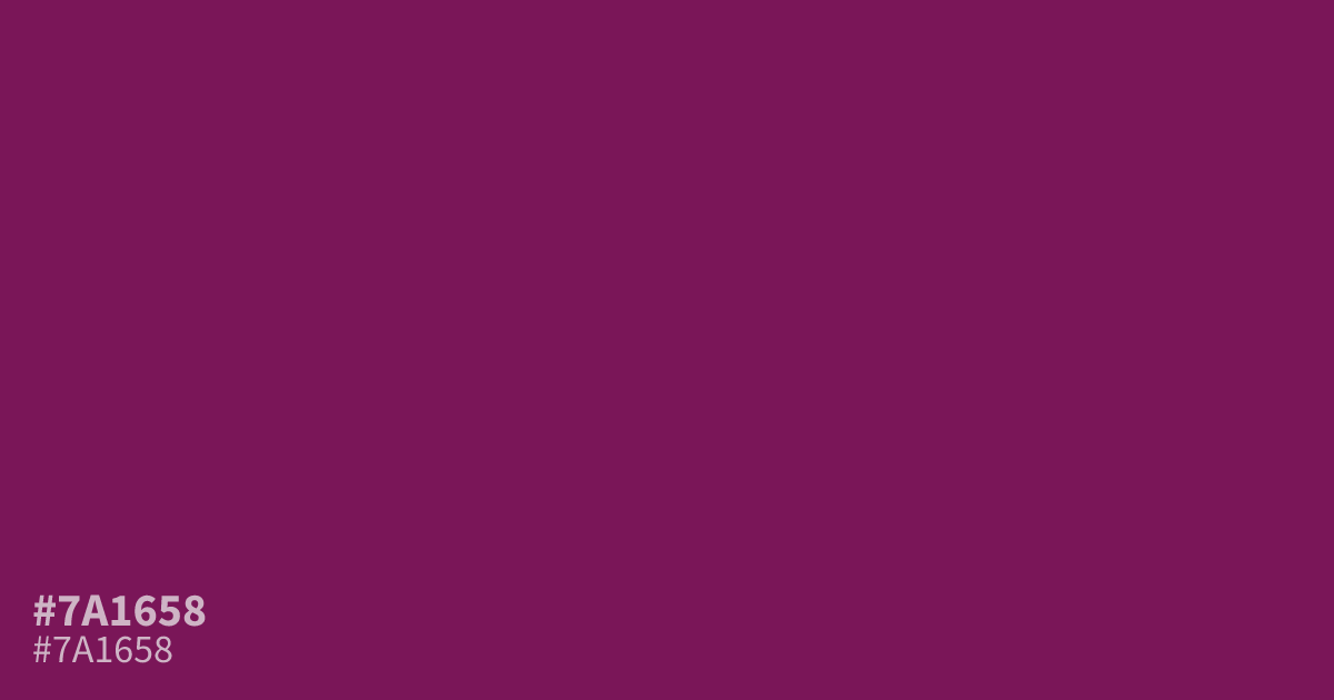
A dark, saturated pink with plum and red undertones, #7a1658 brings a serious, mysterious mood without losing warmth. Use it as a supporting tone in romantic branding, cosmetics, fashion, or moody interfaces. Pair it with blush, cream, or soft gray. White text reads clearly on this shade, and the hex code is #7a1658.
Questions about #7a1658
What is #7a1658 in RGB, HSL and CMYK?
In RGB, #7a1658 is rgb(122, 22, 88), in HSL hsl(320, 69%, 28%) and in CMYK 0%, 82%, 28%, 52%. Browse more shades of pink with names and hex codes.
What colors pair well with #7a1658?
Is #7a1658 warm or cool?
#7a1658 reads as a warm-leaning dark pink because its red and plum undertones give it more warmth than a blue-based purple, creating a serious, mysterious mood that still feels romantic in branding, fashion, cosmetics, and beauty-focused interfaces.
Can I use white text on #7a1658?
Yes, white text on #7a1658 provides strong contrast, around 10:1, while black text is much weaker; use white for buttons, headings, and labels, then check the final text size, weight, and surrounding colors for accessibility.
Is #7a1658 readable on white or black?
#7a1658 has a 10.08:1 contrast ratio on white and 2.08:1 on black. WCAG asks for 4.5:1 for body text and 3:1 for large text, so on white it works for body text and on black it is too faint for text. Try other pairs in the contrast checker.