
#7A060A Hex Color
Deep crimson with a serious, moody weight
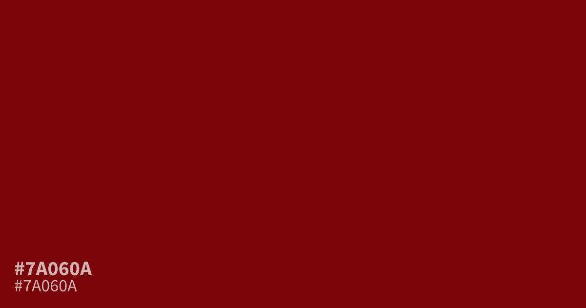
This dim, saturated red carries a serious weight that makes it effective for moody brand palettes or formal designs. Because it is quite dark, the hex code #7a060a works best as an accent color rather than a large background. It pairs exceptionally well with muted gold tones to highlight luxury, and it maintains high readability when paired with clean white text for strong visual contrast.
Questions about #7a060a
What is #7a060a in RGB, HSL and CMYK?
In RGB, #7a060a is rgb(122, 6, 10), in HSL hsl(358, 91%, 25%) and in CMYK 0%, 95%, 92%, 52%. Browse more shades of red with names and hex codes.
What colors pair well with #7a060a for a luxury palette?
This deep red creates a sophisticated, high-end feel when combined with muted gold or soft cream tones. Using it against warm beige or charcoal also anchors the intensity, preventing the red from appearing too harsh while maintaining a professional visual balance.
Is #7a060a readable on white or black?
#7a060a has a 11.30:1 contrast ratio on white and 1.85:1 on black. WCAG asks for 4.5:1 for body text and 3:1 for large text, so on white it works for body text and on black it is too faint for text. Try other pairs in the contrast checker.