
#797091 Hex Color
Online color picker to view shades, tints, color codes, and complementary colors
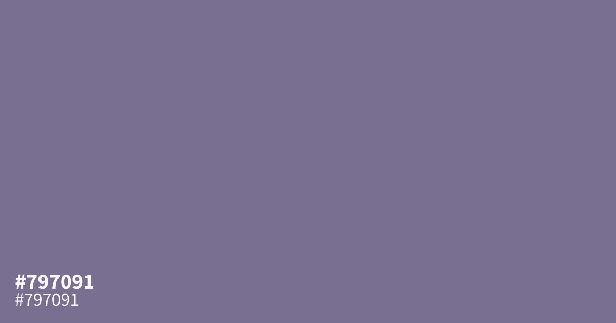
This muted, dusty violet brings a calm, matte finish to interfaces that require subtlety over impact. Because it is highly unsaturated, #797091 works best as a supporting background tone rather than a focal point. Pair it with soft creams or warm grays to avoid a muddy look. White text reads clearly against this shade, making it a functional choice for UI elements needing accessible contrast.
Questions about #797091
What is #797091 in RGB, HSL and CMYK?
In RGB, #797091 is rgb(121, 112, 145), in HSL hsl(256, 13%, 50%) and in CMYK 17%, 23%, 0%, 43%. Browse more shades of purple with names and hex codes.
What colors pair well with #797091 for UI design?
This muted violet works best when paired with warm, neutral tones to keep the palette balanced and readable. Soft creams or warm grays provide the necessary contrast, while pairing it with charcoal text creates a sophisticated, accessible reading experience.
Is #797091 readable on white or black?
#797091 has a 4.62:1 contrast ratio on white and 4.53:1 on black. WCAG asks for 4.5:1 for body text and 3:1 for large text, so on white it works for body text and on black it works for body text. Try other pairs in the contrast checker.