
#78ACD3 Hex Color
Online color picker to view shades, tints, color codes, and complementary colors
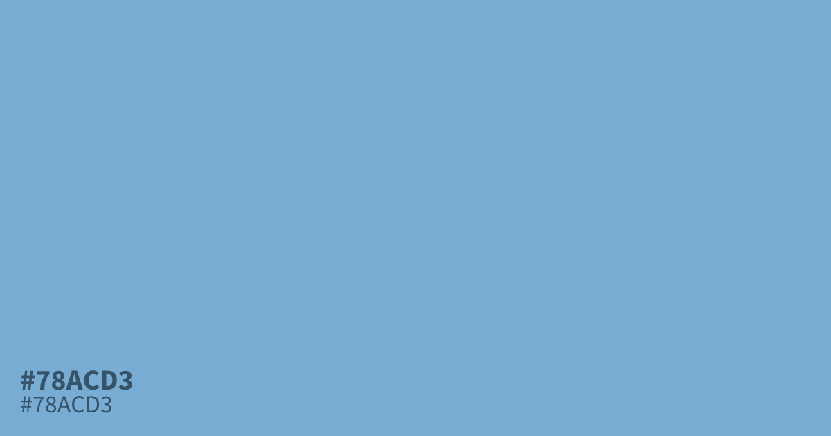
Pastel blue works well as a UI background or supporting tone in healthcare, finance, and baby product layouts. #78acd3 is a muted, ashy take on it, light enough to feel gentle but with enough depth to avoid washing out next to white. It reads best against cream or warm terracotta rather than plain white, and black text stays readable on it at about 8.6:1 contrast. That grayed undertone comes from mixing gray into the hue.
Questions about #78acd3
What is #78acd3 in RGB, HSL and CMYK?
In RGB, #78acd3 is rgb(120, 172, 211), in HSL hsl(206, 51%, 65%) and in CMYK 43%, 18%, 0%, 17%. Browse more shades of blue with names and hex codes.
What colors pair well with #78acd3?
Warm neutrals balance this cool blue best. Try terracotta or cream for contrast, or charcoal for a grounded, professional palette. Cool grays and bright whites tend to make it look washed out.
Is #78acd3 readable on white or black?
#78acd3 has a 2.43:1 contrast ratio on white and 8.64:1 on black. WCAG asks for 4.5:1 for body text and 3:1 for large text, so on white it is too faint for text and on black it works for body text. Try other pairs in the contrast checker.