
#782E9D Hex Color
Online color picker to view shades, tints, color codes, and complementary colors
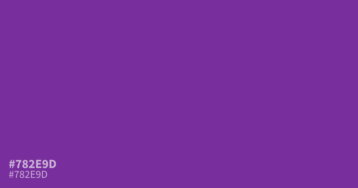
This bold purple commands attention with high saturation and an intense, energetic personality. Because it is quite dark, #782e9d works best as an accent color rather than a primary background for long text. Pair it with soft cream or muted gold to balance its strength. White text remains perfectly legible here, making it a solid choice for striking calls to action or modern UI highlights.
Questions about #782e9d
What is #782e9d in RGB, HSL and CMYK?
In RGB, #782e9d is rgb(120, 46, 157), in HSL hsl(280, 55%, 40%) and in CMYK 24%, 71%, 0%, 38%. Browse more shades of purple with names and hex codes.
Is #782e9d suitable for body text?
No, this hue is too saturated for long-form reading as it creates significant eye strain. Instead, use #782e9d as a vibrant accent color or for UI highlights where high contrast against white or light backgrounds is required for optimal readability and visual impact.
What colors balance the intensity of #782e9d?
Is #782e9d readable on white or black?
#782e9d has a 7.84:1 contrast ratio on white and 2.67:1 on black. WCAG asks for 4.5:1 for body text and 3:1 for large text, so on white it works for body text and on black it is too faint for text. Try other pairs in the contrast checker.