
#746CAC Hex Color
Online color picker to view shades, tints, color codes, and complementary colors
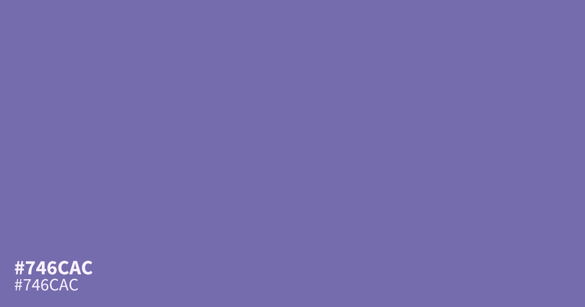
#746cac is a dusty purple, close to weathered lavender or faded slate. Its low saturation keeps it matte and subdued, which suits supporting roles: soft UI backgrounds, dark mode panels, or a 30% tone under brighter accents. It flatters warm metallics like aged brass. White text passes AA on it at roughly 4.7:1 contrast. The hex code #746cac works well in luxury and creative branding where restraint matters.
Questions about #746cac
What is #746cac in RGB, HSL and CMYK?
In RGB, #746cac is rgb(116, 108, 172), in HSL hsl(248, 28%, 55%) and in CMYK 33%, 37%, 0%, 33%. Browse more shades of purple with names and hex codes.
What colors pair well with #746cac?
#746cac pairs well with aged brass, deep plum, and soft charcoal for a moody palette, or with pale sage and cream for a softer, dustier feel. Avoid bright neon accents, which make it look muddy by comparison.
Does #746cac read warm or cool?
#746cac reads cool. Its blue-leaning violet base and gray undertones pull it toward slate, so it sits comfortably in cool palettes but can feel flat next to pure warm hues.
Is #746cac readable on white or black?
#746cac has a 4.68:1 contrast ratio on white and 4.48:1 on black. WCAG asks for 4.5:1 for body text and 3:1 for large text, so on white it works for body text and on black it works only for large text (24px, or 18.5px bold). Try other pairs in the contrast checker.