
#74548C Hex Color
Online color picker to view shades, tints, color codes, and complementary colors
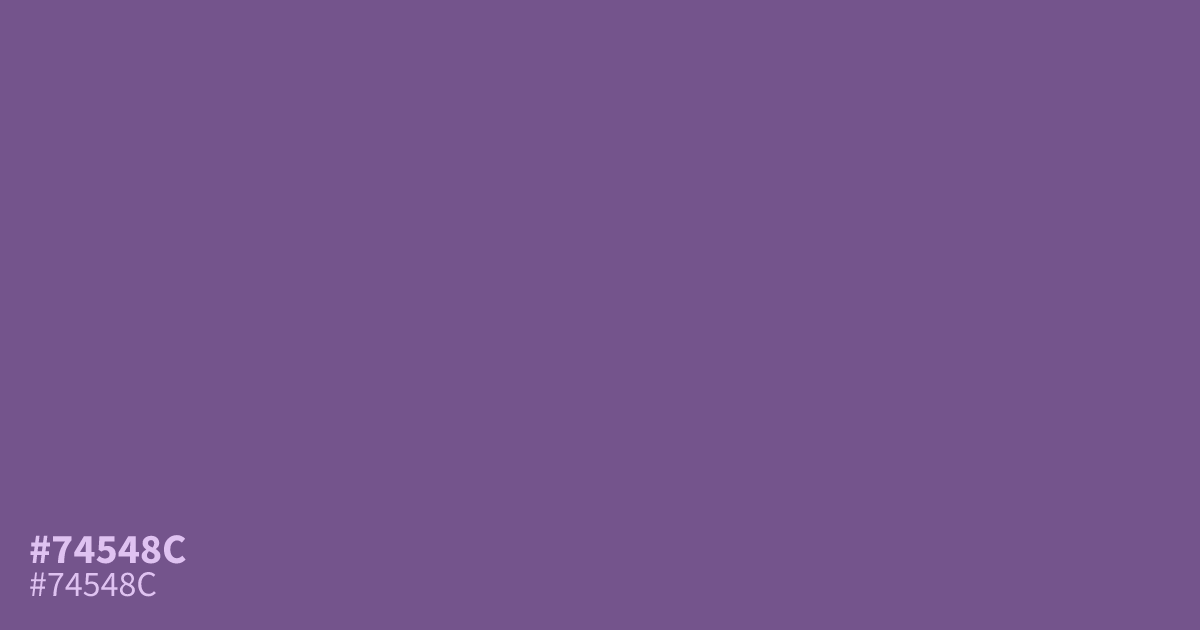
This dusty, muted purple sits on the darker side of the spectrum, offering a dim and moody presence. Because it lacks high saturation, #74548c works best as a supporting background element rather than a primary focal point. It pairs well with cream or light slate tones to balance its cool intensity. For accessible body text, use white to maintain a readable contrast ratio.
Questions about #74548c
What is #74548c in RGB, HSL and CMYK?
In RGB, #74548c is rgb(116, 84, 140), in HSL hsl(274, 25%, 44%) and in CMYK 17%, 40%, 0%, 45%. Browse more shades of purple with names and hex codes.
What colors pair best with #74548c for a balanced palette?
Is #74548c suitable for body text or headlines?
Because #74548c is quite dark and low in saturation, it can function as a soft alternative to black text for a gentler, more refined reading experience. However, always test the contrast ratio against your background to ensure it meets accessibility standards.
Is #74548c readable on white or black?
#74548c has a 6.19:1 contrast ratio on white and 3.38:1 on black. WCAG asks for 4.5:1 for body text and 3:1 for large text, so on white it works for body text and on black it works only for large text (24px, or 18.5px bold). Try other pairs in the contrast checker.