
#73628F Hex Color
A serious, dusty violet for UI design
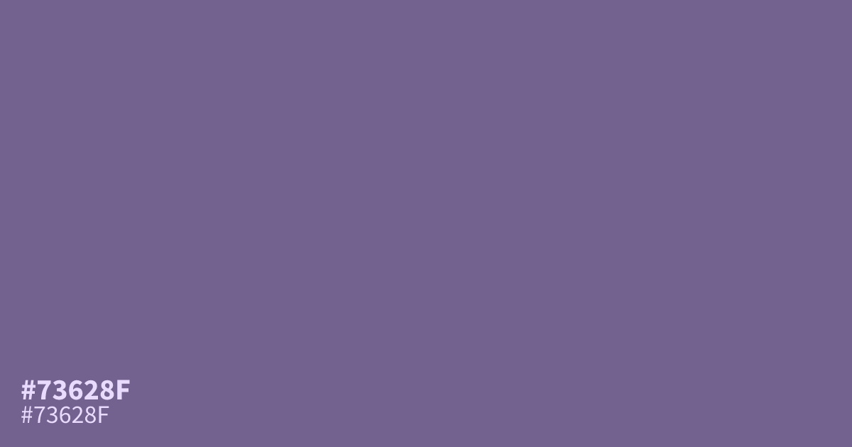
This muted, dusty violet carries an ashy undertone that reads serious rather than whimsical. Because it is unsaturated and cool, #73628f works best as a secondary or supporting color rather than a primary background. It looks especially sophisticated when paired with soft creams or warm grays. White text provides enough contrast to remain readable, making this hex code a reliable choice for UI accents.
Questions about #73628f
What is #73628f in RGB, HSL and CMYK?
In RGB, #73628f is rgb(115, 98, 143), in HSL hsl(263, 19%, 47%) and in CMYK 20%, 31%, 0%, 44%. Browse more shades of purple with names and hex codes.
What colors pair best with #73628f?
#73628f looks best when paired with neutral, warm tones like cream or warm gray to balance its cool, ashy undertones. These pairings soften the seriousness of the color, making it perfect for UI accents or supporting graphic elements without overwhelming your layout.
Is #73628f suitable for large background areas?
Because #73628f is a muted, unsaturated violet, it works better as a secondary supporting color than a primary background. It can feel heavy if used across large surfaces, so use it for interactive elements or text headers instead to maintain visual comfort.
Is #73628f readable on white or black?
#73628f has a 5.42:1 contrast ratio on white and 3.87:1 on black. WCAG asks for 4.5:1 for body text and 3:1 for large text, so on white it works for body text and on black it works only for large text (24px, or 18.5px bold). Try other pairs in the contrast checker.