
#717B3C Hex Color
Online color picker to view shades, tints, color codes, and complementary colors
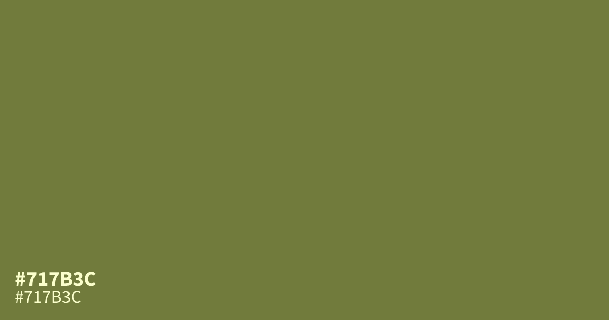
A dry olive pulled toward yellow, #717b3c reads earthy and mellow rather than bright. It suits outdoor brands, packaging, and organic layouts, and pairs well with cream or terracotta. Black text stays readable on it, which makes it work as a background for labels and badges.
Questions about #717b3c
What is #717b3c in RGB, HSL and CMYK?
In RGB, #717b3c is rgb(113, 123, 60), in HSL hsl(70, 34%, 36%) and in CMYK 8%, 0%, 51%, 52%. Browse more shades of green with names and hex codes.
What colors pair well with #717b3c?
Cream, terracotta, and warm gray all sit comfortably beside #717b3c without competing with it. For stronger contrast, pair it with charcoal text or a deep plum accent.
Is #717b3c a warm or cool color?
#717b3c leans warm, since its yellow base pulls it toward gold rather than blue. That warmth keeps it feeling earthy instead of cold, even at darker values.
Can white text be used on #717b3c?
White text on #717b3c falls short of WCAG AA contrast and should be avoided for body copy. Black or very dark text reads far more clearly against this shade.
Is #717b3c readable on white or black?
#717b3c has a 4.56:1 contrast ratio on white and 4.60:1 on black. WCAG asks for 4.5:1 for body text and 3:1 for large text, so on white it works for body text and on black it works for body text. Try other pairs in the contrast checker.