
#715EE6 Hex Color
Online color picker to view shades, tints, color codes, and complementary colors
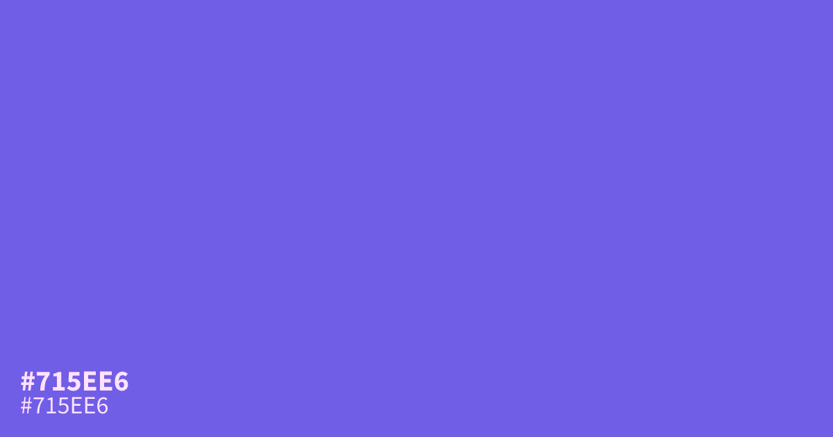
Loud and saturated, #715ee6 is a vivid violet with a cool blue undertone that beams rather than sits back. That energy makes it a strong accent for CTAs, highlights, and gaming or creative brand work, though full screens of it can overwhelm. White text passes AA contrast on top at about 4.7:1, so it works behind light body copy. Tamed with what colors make gray, it softens into a calmer mauve for larger surfaces.
Questions about #715ee6
What is #715ee6 in RGB, HSL and CMYK?
In RGB, #715ee6 is rgb(113, 94, 230), in HSL hsl(248, 73%, 64%) and in CMYK 51%, 59%, 0%, 10%. Browse more shades of purple with names and hex codes.
What colors pair well with #715ee6?
Warm amber and burnt orange give #715ee6 the strongest pop, since their heat offsets its cool blue undertone. Charcoal grounds it for dark interfaces, and soft cream mellows it for editorial layouts. Keep other bright purples away or the palette turns muddy.
Where does #715ee6 work best in a design?
As an accent, not a base. Use it for calls to action, highlights, and creative or gaming branding at the 10% mark. At full background scale it gets loud fast, so switch to a darker indigo for large surfaces.
Is #715ee6 readable on white or black?
#715ee6 has a 4.72:1 contrast ratio on white and 4.44:1 on black. WCAG asks for 4.5:1 for body text and 3:1 for large text, so on white it works for body text and on black it works only for large text (24px, or 18.5px bold). Try other pairs in the contrast checker.