
#7127A6 Hex Color
Deep purple with a muted, serious edge
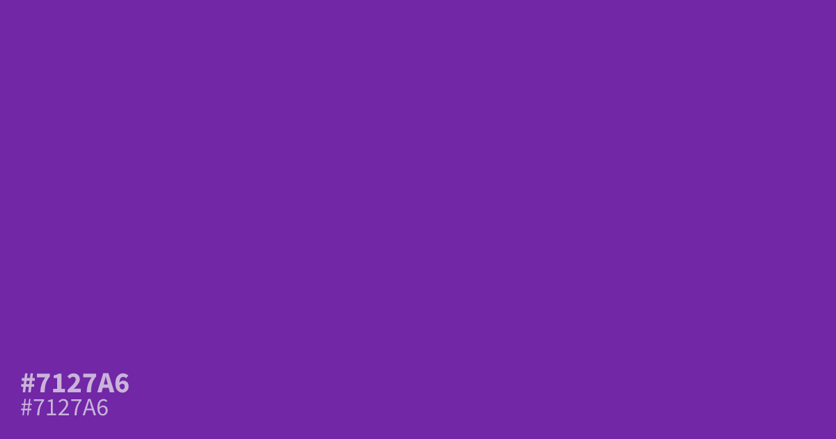
For dark mode interfaces or moody brand palettes, #7127a6 is a deep purple with a muted, cool edge. Its low lightness gives it a serious, mysterious character, and white text reaches about 8.3:1 contrast, enough for small body copy. Pair it with warm gold or dusty mauve accents. It works best as a dominant base with lighter purples nearby, since large flat areas can read dull.
Questions about #7127a6
What is #7127a6 in RGB, HSL and CMYK?
In RGB, #7127a6 is rgb(113, 39, 166), in HSL hsl(275, 62%, 40%) and in CMYK 32%, 77%, 0%, 35%. Browse more shades of purple with names and hex codes.
What colors pair well with #7127a6?
Warm gold, dusty mauve, and burgundy all flatter the cool, muted undertone of #7127a6, and burgundy makes a richer companion than neutral gray does. Skip soft pastels beside it, since they wash the purple out.
Is #7127a6 readable on white or black?
#7127a6 has a 8.25:1 contrast ratio on white and 2.54:1 on black. WCAG asks for 4.5:1 for body text and 3:1 for large text, so on white it works for body text and on black it is too faint for text. Try other pairs in the contrast checker.