
#700A38 Hex Color
Online color picker to view shades, tints, color codes, and complementary colors
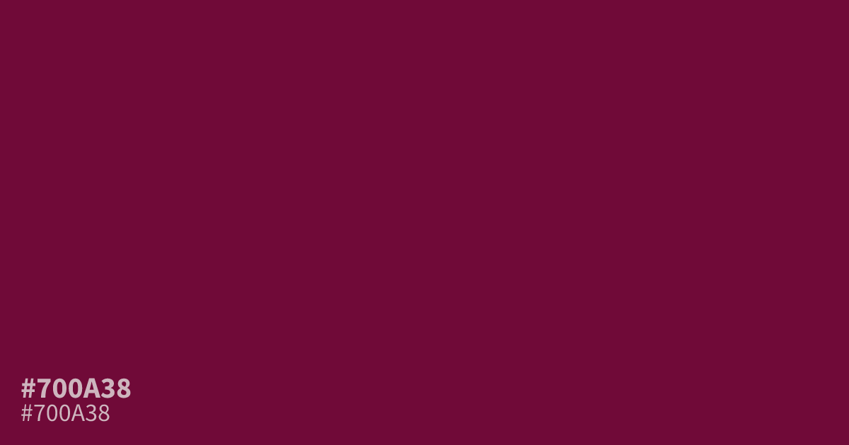
#700a38 is a saturated, deep berry tone with significant darkness and warmth. It carries a heavy, serious mood that works well for moody branding or intimate, high-contrast layouts. Because white text offers excellent legibility against this backdrop, it functions perfectly as a dominant background color. Pair it with soft, muted teals to balance its intense, romantic weight.
Questions about #700a38
What is #700a38 in RGB, HSL and CMYK?
In RGB, #700a38 is rgb(112, 10, 56), in HSL hsl(333, 84%, 24%) and in CMYK 0%, 91%, 50%, 56%. Browse more shades of pink with names and hex codes.
What colors pair well with the deep berry of #700a38?
Soft, muted teals provide the best balance for the intense, romantic weight of #700a38 by acting as a cool, neutralizing contrast. Alternatively, pairing it with cream or off-white ensures excellent readability and keeps the high-contrast aesthetic feeling clean and sophisticated.
Is #700a38 a good choice for background elements in digital design?
#700a38 functions effectively as a dominant background color because it provides a dark, rich field that allows white or light-toned typography to pop with high legibility. It creates an intimate, serious mood perfect for brands seeking a luxurious or mysterious visual identity.
Is #700a38 readable on white or black?
#700a38 has a 11.73:1 contrast ratio on white and 1.78:1 on black. WCAG asks for 4.5:1 for body text and 3:1 for large text, so on white it works for body text and on black it is too faint for text. Try other pairs in the contrast checker.