
#6F5981 Hex Color
Online color picker to view shades, tints, color codes, and complementary colors
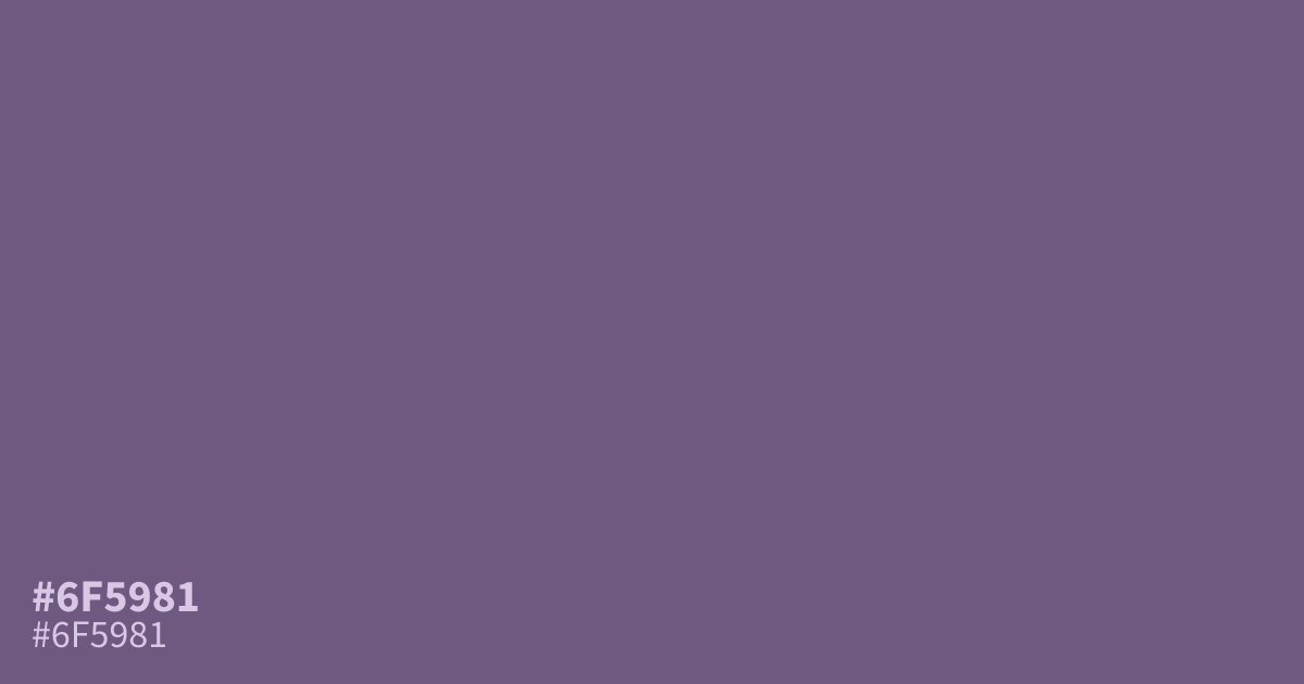
This dusty, muted violet feels grounded and serious. Because #6f5981 is highly unsaturated, it works best as a moody, atmospheric background rather than a focal point. Pair it with crisp white text, which pops against this dark shade with high legibility. It feels a bit like stone or worn fabric, bringing a sense of quiet order to UI designs that need to avoid bright, jarring colors.
Questions about #6f5981
What is #6f5981 in RGB, HSL and CMYK?
In RGB, #6f5981 is rgb(111, 89, 129), in HSL hsl(273, 18%, 43%) and in CMYK 14%, 31%, 0%, 49%. Browse more shades of purple with names and hex codes.
How should I use #6f5981 in a UI design?
#6f5981 acts best as an atmospheric background that grounds a design without overwhelming the viewer. Because it is highly unsaturated, pair it with crisp white text to maintain high legibility and avoid the visual clutter of brighter purple tones.
What colors complement the moody tone of #6f5981?
This shade pairs beautifully with neutral charcoal or soft off-white tones to maintain its serious, professional feel. You can also introduce warmth with muted terracotta accents to create a more sophisticated, balanced palette without losing the color's inherent stone-like quality.
Is #6f5981 readable on white or black?
#6f5981 has a 6.13:1 contrast ratio on white and 3.42:1 on black. WCAG asks for 4.5:1 for body text and 3:1 for large text, so on white it works for body text and on black it works only for large text (24px, or 18.5px bold). Try other pairs in the contrast checker.