
#6E3C7E Hex Color
Online color picker to view shades, tints, color codes, and complementary colors
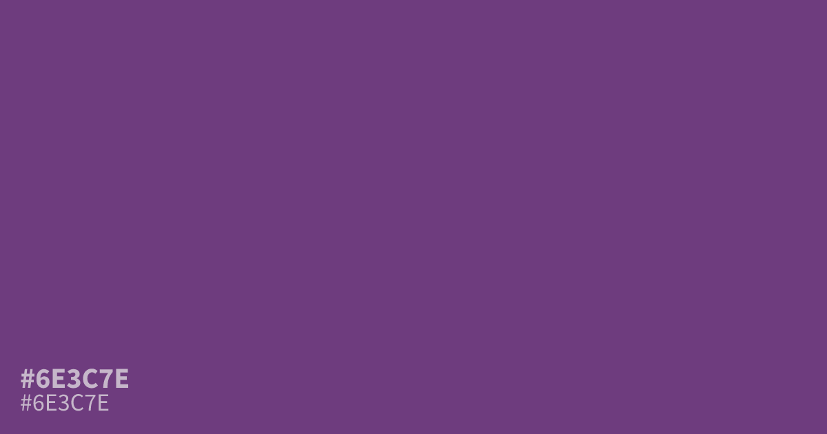
Muted and moderately dark, #6e3c7e is a dusty purple with cool violet undertones and a matte, serious feel. It brings mystery and structure to branding, gaming interfaces, spiritual designs, and moody layouts. Use it as a supporting tone beside warm cream or muted gold. White text remains highly readable, with about an 8:1 contrast ratio. The hex code is #6e3c7e.
Questions about #6e3c7e
What is #6e3c7e in RGB, HSL and CMYK?
In RGB, #6e3c7e is rgb(110, 60, 126), in HSL hsl(285, 35%, 36%) and in CMYK 13%, 52%, 0%, 51%. Browse more shades of purple with names and hex codes.
What colors pair well with #6e3c7e?
#6e3c7e pairs well with warm cream, muted gold, and soft gray, which balance its cool violet undertones without competing with its muted, serious character. Use cream for backgrounds and gold sparingly for highlights or calls to action.
Is #6e3c7e warm or cool?
#6e3c7e reads as a cool purple because its violet undertones pull it toward blue rather than red. Its muted saturation and moderate darkness keep the effect grounded, making it feel more reserved and structured than bright or playful purples.
Where does #6e3c7e work well?
#6e3c7e works well in gaming interfaces, spiritual designs, and moody layouts where a sense of mystery and structure fits. Use it as a supporting color with warm, light backgrounds rather than as the only tone in a full palette.
Is #6e3c7e readable on white or black?
#6e3c7e has a 8.04:1 contrast ratio on white and 2.61:1 on black. WCAG asks for 4.5:1 for body text and 3:1 for large text, so on white it works for body text and on black it is too faint for text. Try other pairs in the contrast checker.