
#6E2137 Hex Color
Online color picker to view shades, tints, color codes, and complementary colors
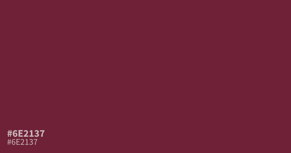
This desaturated, deep red carries a moody, somber weight perfect for formal or high-contrast design. Because #6e2137 is so dark, it works better as a supporting tone or accent rather than a full-page background. White text pops against this shade with excellent legibility. Try pairing it with cool, muted grays or creams to ground its intense, traditional character without overwhelming the viewer.
Questions about #6e2137
What is #6e2137 in RGB, HSL and CMYK?
In RGB, #6e2137 is rgb(110, 33, 55), in HSL hsl(343, 54%, 28%) and in CMYK 0%, 70%, 50%, 57%. Browse more shades of pink with names and hex codes.
How should I use #6e2137 in my design layout?
#6e2137 functions best as a focused accent or border color rather than a primary background because of its extreme depth. Pair it with crisp white text to maintain high readability or use it alongside cream to soften its harsh, traditional edge.
Is #6e2137 readable on white or black?
#6e2137 has a 10.84:1 contrast ratio on white and 1.93:1 on black. WCAG asks for 4.5:1 for body text and 3:1 for large text, so on white it works for body text and on black it is too faint for text. Try other pairs in the contrast checker.