
#6E1C2E Hex Color
Moody wine red with plum depth
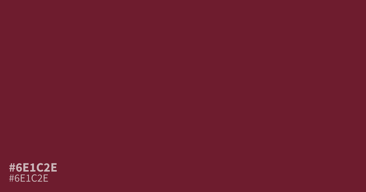
Dark and moderately saturated, #6e1c2e is a warm red with wine and plum undertones. Its low lightness gives layouts a serious, moody character, while its rich chroma adds passion and urgency without looking bright. Use it as a dominant background with white text, which reaches about 11.2:1 contrast, or pair it with muted cream for luxury branding. The hex code is #6e1c2e.
Questions about #6e1c2e
What is #6e1c2e in RGB, HSL and CMYK?
In RGB, #6e1c2e is rgb(110, 28, 46), in HSL hsl(347, 59%, 27%) and in CMYK 0%, 75%, 58%, 57%. Browse more shades of red with names and hex codes.
What colors pair well with #6e1c2e for a polished palette?
Does #6e1c2e read as a warm or cool color?
#6e1c2e reads as a warm red because its wine base carries red and plum undertones rather than blue-violet coolness, while its low lightness keeps that warmth restrained and gives the shade a serious, intimate mood instead of a bright or fiery character.
Where should designers use #6e1c2e?
#6e1c2e works best as a deep background, headline color, button accent, or packaging detail when you want a serious, intimate mood with a premium edge in editorial, beauty, food, or luxury-focused visuals. Pair it with generous light space and light text so layouts feel balanced.
Is #6e1c2e readable on white or black?
#6e1c2e has a 11.23:1 contrast ratio on white and 1.86:1 on black. WCAG asks for 4.5:1 for body text and 3:1 for large text, so on white it works for body text and on black it is too faint for text. Try other pairs in the contrast checker.