
#6C2D52 Hex Color
Online color picker to view shades, tints, color codes, and complementary colors
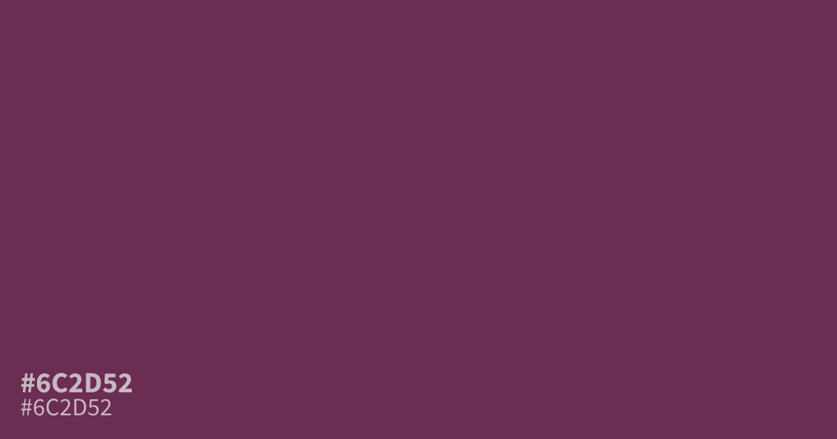
This deep, unsaturated plum-pink carries a moody, serious weight. Because #6c2d52 feels dim and grounded, it works best as a supporting accent in dark interfaces rather than a dominant background. Pair it with soft cream or dusty gold to lighten its heaviness. It offers enough contrast for readable text, making it a reliable choice for elegant, high-contrast typography in branding.
Questions about #6c2d52
What is #6c2d52 in RGB, HSL and CMYK?
In RGB, #6c2d52 is rgb(108, 45, 82), in HSL hsl(325, 41%, 30%) and in CMYK 0%, 58%, 24%, 58%. Browse more shades of pink with names and hex codes.
What colors pair well with #6c2d52 in a UI design?
#6c2d52 thrives when paired with lighter, neutral tones that prevent the interface from feeling too closed-in. Use soft cream or a dusty gold as a background or text accent to balance its heavy, dim, and serious nature.
Is #6c2d52 suitable for body text or headlines?
This color offers strong contrast against lighter backgrounds, making it a reliable choice for elegant, high-contrast typography in branding. However, avoid using it on dark backgrounds where the saturation may cause the text to recede and lose readability.
Is #6c2d52 readable on white or black?
#6c2d52 has a 9.83:1 contrast ratio on white and 2.13:1 on black. WCAG asks for 4.5:1 for body text and 3:1 for large text, so on white it works for body text and on black it is too faint for text. Try other pairs in the contrast checker.