
#6B4331 Hex Color
A serious and deeply grounded matte brown
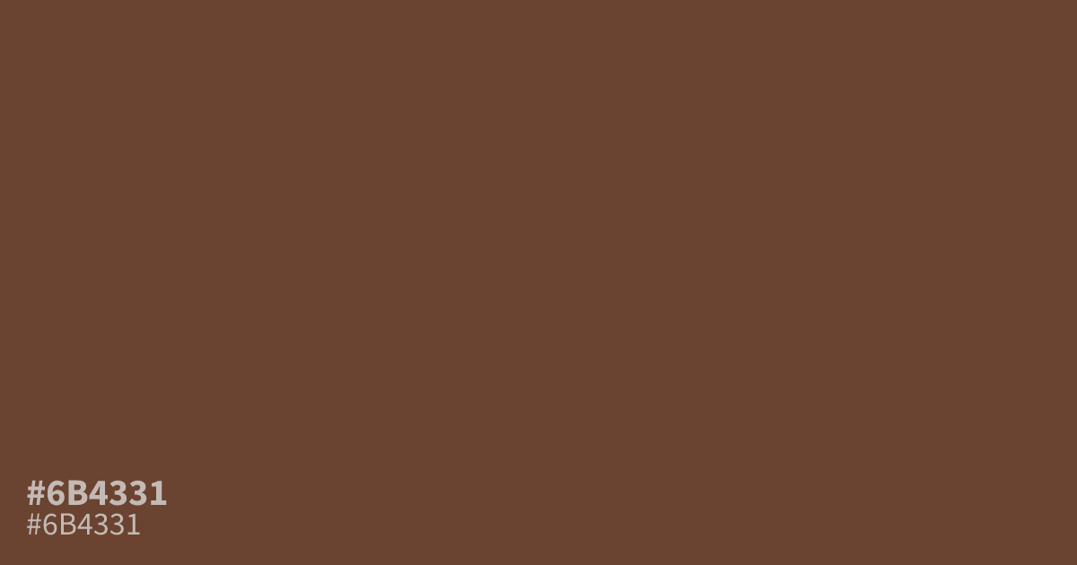
This dusty, unsaturated brown feels incredibly grounded and serious. Because #6b4331 is quite dark, it works best as a moody background or a grounding supporting element rather than a primary focus. Pair it with soft cream or muted gold to cut the gloom. It provides excellent accessibility for white text, which pops against this matte, earthy shade with strong, reliable clarity.
Questions about #6b4331
What is #6b4331 in RGB, HSL and CMYK?
In RGB, #6b4331 is rgb(107, 67, 49), in HSL hsl(19, 37%, 31%) and in CMYK 0%, 37%, 54%, 58%. Browse more shades of brown with names and hex codes.
Does #6b4331 work well for interface text?
#6b4331 is generally too dark for body text on anything but the lightest backgrounds, so use it primarily for footer sections or grounding backgrounds where white text remains highly legible. It carries a heavy, serious presence that anchors user interface layouts effectively.
What colors pair best with #6b4331?
This shade pairs beautifully with cream or muted gold to balance its heavy, moody nature and prevent the design from feeling too dark. Using lighter neutrals allows this grounded, matte brown to function as a stable, professional anchor in your palette.
Is #6b4331 readable on white or black?
#6b4331 has a 8.49:1 contrast ratio on white and 2.47:1 on black. WCAG asks for 4.5:1 for body text and 3:1 for large text, so on white it works for body text and on black it is too faint for text. Try other pairs in the contrast checker.