
#6B3F6D Hex Color
Online color picker to view shades, tints, color codes, and complementary colors
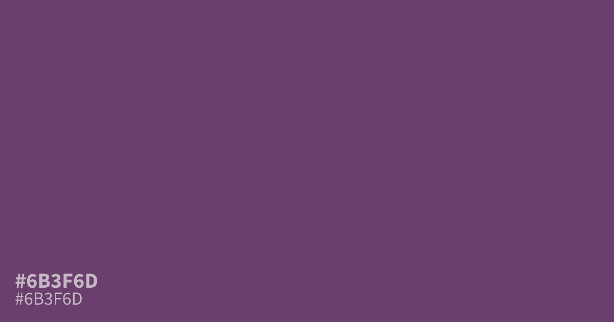
Not a bright violet, #6b3f6d is a dark, dusty purple with a muted, matte finish. Its low saturation keeps the mood gloomy and serious rather than playful, which suits dark mode interfaces, luxury branding, and moody game palettes. It works best as a dominant base or supporting tone, and looks richer beside soft gold or dusty rose than beside plain white. White text hits about 8.2:1 contrast, well past WCAG AA for small body text.
Questions about #6b3f6d
What is #6b3f6d in RGB, HSL and CMYK?
In RGB, #6b3f6d is rgb(107, 63, 109), in HSL hsl(297, 27%, 34%) and in CMYK 2%, 42%, 0%, 57%. Browse more shades of purple with names and hex codes.
What colors pair well with #6b3f6d?
Soft gold and dusty rose bring out its richness, while sage green adds a muted, natural balance. Keep pairings desaturated so this purple stays moody instead of turning muddy.
Is #6b3f6d readable on white or black?
#6b3f6d has a 8.21:1 contrast ratio on white and 2.55:1 on black. WCAG asks for 4.5:1 for body text and 3:1 for large text, so on white it works for body text and on black it is too faint for text. Try other pairs in the contrast checker.