
#6A5671 Hex Color
Online color picker to view shades, tints, color codes, and complementary colors
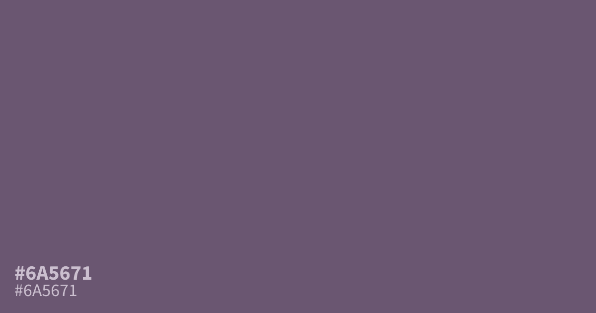
A dark, dusty purple, #6a5671 has low saturation and a matte, ashy finish that feels serious, mysterious, and restrained. The hex code works well as a supporting tone in moody branding, luxury packaging, spiritual projects, and dark interfaces. Pair it with warm cream or muted gold, while white text offers strong readable contrast at about 6.6:1.
Questions about #6a5671
What is #6a5671 in RGB, HSL and CMYK?
In RGB, #6a5671 is rgb(106, 86, 113), in HSL hsl(284, 14%, 39%) and in CMYK 6%, 24%, 0%, 56%. Browse more shades of purple with names and hex codes.
What colors pair well with #6a5671?
#6a5671 pairs well with warm cream, muted gold, terracotta, and charcoal, which balance its dusty purple base without making the palette overly bright or decorative. Use cream for space, gold for small accents, and terracotta when the design needs warmth.
Is #6a5671 readable on white or black?
#6a5671 has a 6.59:1 contrast ratio on white and 3.18:1 on black. WCAG asks for 4.5:1 for body text and 3:1 for large text, so on white it works for body text and on black it works only for large text (24px, or 18.5px bold). Try other pairs in the contrast checker.