
#6A3727 Hex Color
Dark reddish brown with dusty warmth
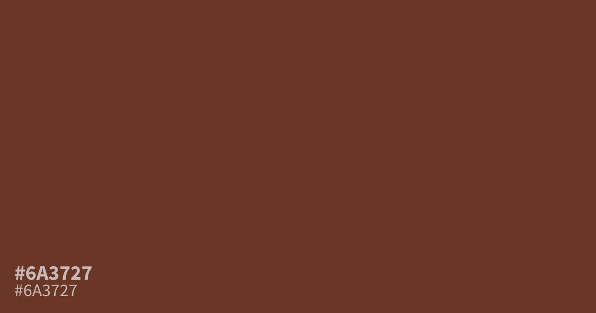
Wine labels, leather goods, and autumn packaging often call for a dark reddish brown like #6a3727. This muted, warm shade carries dusty, ashy undertones that keep it grounded instead of loud. It works best as a dominant base rather than an accent, since it can read muddy in small doses. White text sits comfortably on top at roughly 9.6:1 contrast, so it holds up as a background for body copy. Pair it with cream, sage, or muted gold for a rich, earthy palette.
Questions about #6a3727
What is #6a3727 in RGB, HSL and CMYK?
In RGB, #6a3727 is rgb(106, 55, 39), in HSL hsl(14, 46%, 28%) and in CMYK 0%, 48%, 63%, 58%. Browse more shades of brown with names and hex codes.
What colors pair well with #6a3727?
#6a3727 pairs well with sage, cream, and muted gold, which lift its darkness without fighting its warmth. Navy and deep forest green also work for richer, more formal palettes.
Does #6a3727 read as a warm or cool color?
#6a3727 reads warm. Its red undertones show through despite the low saturation, though the darkness and dustiness mellow that warmth into something subdued rather than fiery.
Is #6a3727 readable on white or black?
#6a3727 has a 9.59:1 contrast ratio on white and 2.18:1 on black. WCAG asks for 4.5:1 for body text and 3:1 for large text, so on white it works for body text and on black it is too faint for text. Try other pairs in the contrast checker.