
#6A2145 Hex Color
Online color picker to view shades, tints, color codes, and complementary colors
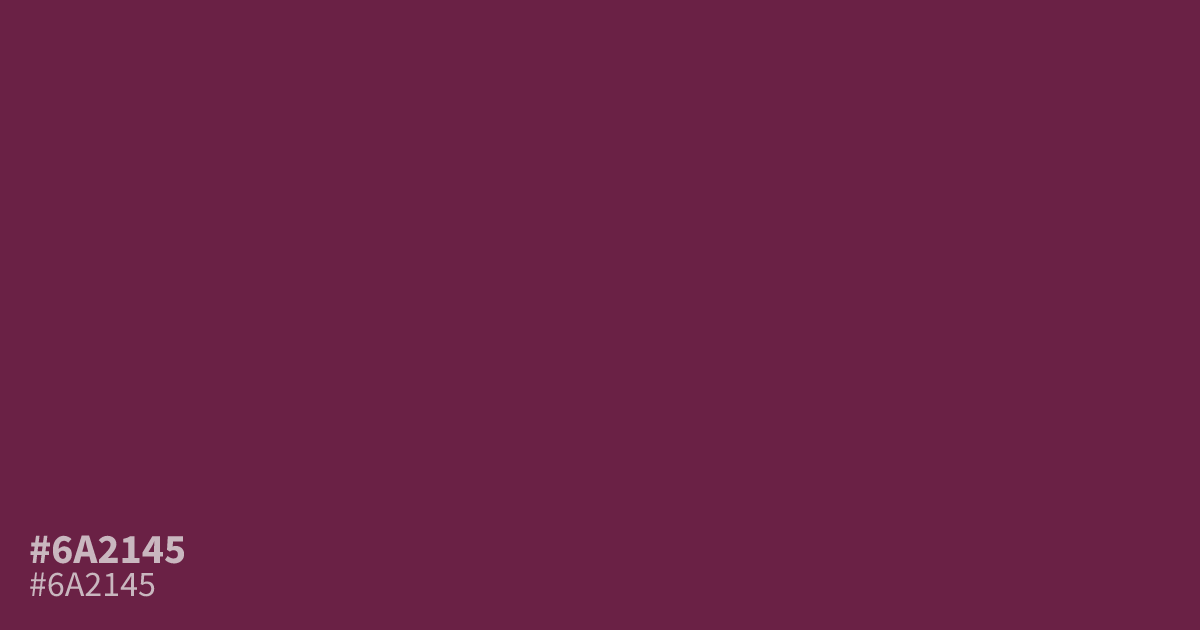
This dark, muted berry tone feels serious and moody, stripping away the sugary associations of brighter pinks. Because of its depth, #6a2145 works best as a primary base for brand identities or high-contrast UI backgrounds. White text creates excellent legibility against its surface. Pair it with soft, warm creams to temper its intensity or use it alongside charcoal for a sophisticated, grounded aesthetic.
Questions about #6a2145
What is #6a2145 in RGB, HSL and CMYK?
In RGB, #6a2145 is rgb(106, 33, 69), in HSL hsl(330, 53%, 27%) and in CMYK 0%, 69%, 35%, 58%. Browse more shades of pink with names and hex codes.
What colors pair best with the muted berry tone of #6a2145?
This deep shade balances beautifully against soft, warm creams to temper its intensity or alongside charcoal for a sophisticated, grounded aesthetic. Because of its inherent darkness, using neutral, lighter tones helps maintain visual harmony in your layout.
Is #6a2145 suitable for text-heavy interfaces?
While #6a2145 functions well as a bold background color, it is best reserved for accent elements or branding rather than long-form body text. If you use it as a background, ensure your foreground text is white to guarantee high legibility.
Is #6a2145 readable on white or black?
#6a2145 has a 10.95:1 contrast ratio on white and 1.91:1 on black. WCAG asks for 4.5:1 for body text and 3:1 for large text, so on white it works for body text and on black it is too faint for text. Try other pairs in the contrast checker.