
#694D3B Hex Color
Online color picker to view shades, tints, color codes, and complementary colors
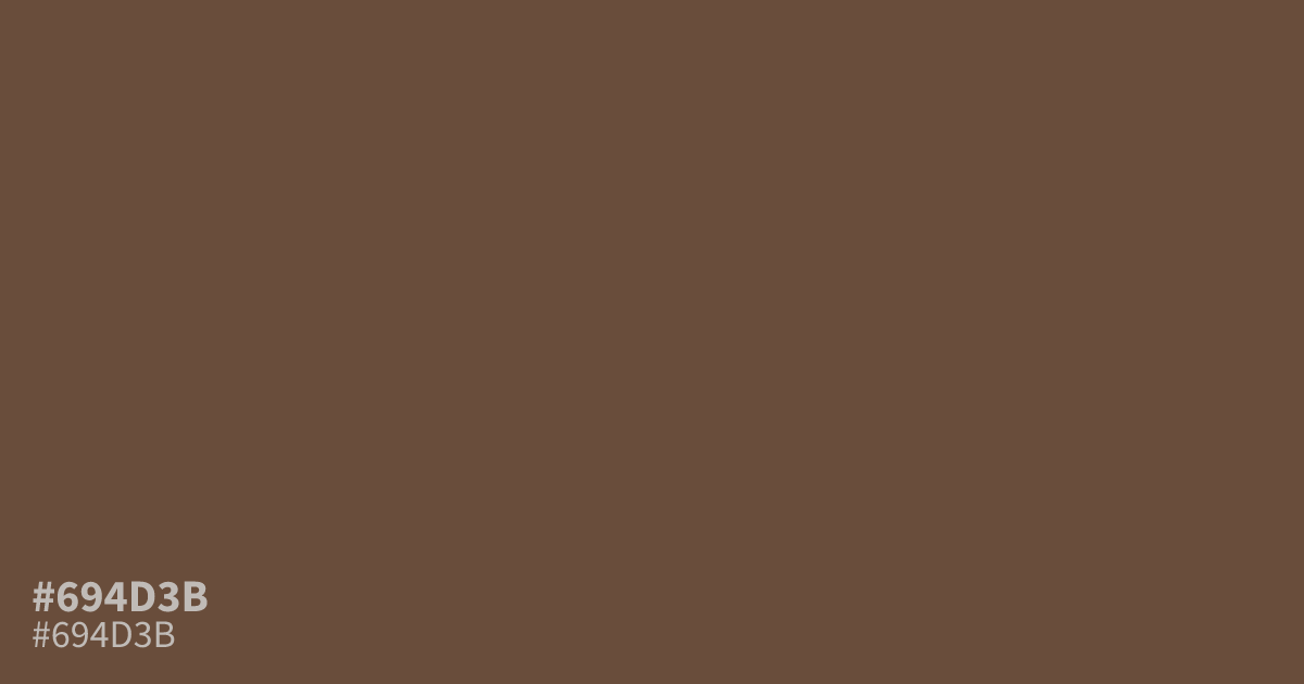
Muted and dark, #694d3b is a dusty brown with warm red undertones and very low saturation. Its matte, shadowed quality suggests seriousness, reliability, and warmth without demanding attention. Use the hex code #694d3b as a supporting tone in vintage, coffee, chocolate, or artisan branding, or for moody backgrounds with white text, which reaches strong contrast. It can look muddy in large, flat areas.
Questions about #694d3b
What is #694d3b in RGB, HSL and CMYK?
In RGB, #694d3b is rgb(105, 77, 59), in HSL hsl(23, 28%, 32%) and in CMYK 0%, 27%, 44%, 59%. Browse more shades of brown with names and hex codes.
Which colors pair well with #694d3b?
Pair #694d3b with cream, warm white, muted sage, or terracotta for an earthy palette; use charcoal sparingly, since similarly dark colors can reduce separation and make the brown look muddy.
Is #694d3b warm or cool?
#694d3b reads warm because its muted brown base carries noticeable red undertones, though its low saturation keeps the effect restrained rather than rich or fiery. That balance suits grounded, serious palettes better than bright, energetic ones.
Does #694d3b work with white text?
White text provides strong contrast on #694d3b, while black text is too close in luminance for many accessibility needs; verify the exact text size and weight with a contrast checker before publishing.
Where does #694d3b work best in a palette?
Use #694d3b as a supporting color in coffee, chocolate, artisan, and vintage-inspired designs, or as a moody background with light text; its low saturation feels dependable and understated, but large flat areas may appear muddy.
Is #694d3b readable on white or black?
#694d3b has a 7.70:1 contrast ratio on white and 2.72:1 on black. WCAG asks for 4.5:1 for body text and 3:1 for large text, so on white it works for body text and on black it is too faint for text. Try other pairs in the contrast checker.