
#68B27E Hex Color
Online color picker to view shades, tints, color codes, and complementary colors
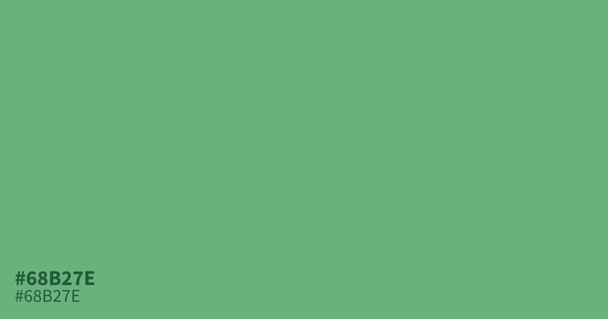
#68b27e is a soft, muted green with a gray undertone that keeps it calm and easy to look at. It works well for wellness brands, spring layouts, and anywhere a natural, low-key feel matters. Use it as a background or accent with warm neutrals like cream and terracotta, and save darker green for text to keep contrast readable.
Questions about #68b27e
What is #68b27e in RGB, HSL and CMYK?
In RGB, #68b27e is rgb(104, 178, 126), in HSL hsl(138, 32%, 55%) and in CMYK 42%, 0%, 29%, 30%. Browse more shades of green with names and hex codes.
What colors pair well with #68b27e?
This shade pairs well with cream, charcoal, and warm terracotta. Its muted green undertone also complements pale pinks and soft blues for a gentle, balanced palette.
Is #68b27e a warm or cool green?
It sits close to neutral with a slight cool lean. The gray undertone keeps it from reading warm, while the light pastel base stops it from feeling cold or harsh.
Can #68b27e work for text?
Not for small body text. Its lightness falls short of recommended contrast on white, so use it for large headings or backgrounds instead of fine print.
Is #68b27e readable on white or black?
#68b27e has a 2.54:1 contrast ratio on white and 8.25:1 on black. WCAG asks for 4.5:1 for body text and 3:1 for large text, so on white it is too faint for text and on black it works for body text. Try other pairs in the contrast checker.