
#632C44 Hex Color
Online color picker to view shades, tints, color codes, and complementary colors
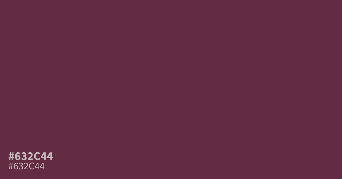
This dusty, muted berry tone feels serious and grounded. Because #632c44 is so desaturated and dark, it functions best as a supporting element or a moody background rather than a primary color. Pair it with soft, warm creams to keep the design from feeling too gloomy. White text provides excellent readability against this hex code, making it a viable choice for UI elements.
Questions about #632c44
What is #632c44 in RGB, HSL and CMYK?
In RGB, #632c44 is rgb(99, 44, 68), in HSL hsl(334, 38%, 28%) and in CMYK 0%, 56%, 31%, 61%. Browse more shades of pink with names and hex codes.
What colors pair well with #632c44?
This deep, muted berry tone pairs beautifully with warm, creamy off-whites to prevent the design from feeling too gloomy. For a sophisticated contrast, consider incorporating charcoal or soft neutral greys to ground the overall palette without overwhelming the richness of #632c44.
Is #632c44 a good choice for UI text?
#632c44 provides excellent readability when used as a background for white text or light, high-contrast UI elements. Because it is quite dark, avoid using it as a text color against dark backgrounds, as the low contrast will negatively impact legibility for users.
Is #632c44 readable on white or black?
#632c44 has a 10.63:1 contrast ratio on white and 1.97:1 on black. WCAG asks for 4.5:1 for body text and 3:1 for large text, so on white it works for body text and on black it is too faint for text. Try other pairs in the contrast checker.