
#626C85 Hex Color
Online color picker to view shades, tints, color codes, and complementary colors
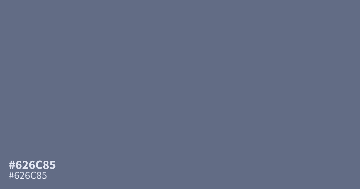
A muted, dusty blue, #626c85 functions as a reliable neutral that anchors professional layouts. Its low saturation provides a subtle background without overwhelming the interface. This color pairs well with crisp white text, which meets WCAG accessibility standards for readability. Because it leans ashy and dim, use it as a supporting tone rather than a dominant splash to avoid a muddy appearance on screens.
Questions about #626c85
What is #626c85 in RGB, HSL and CMYK?
In RGB, #626c85 is rgb(98, 108, 133), in HSL hsl(223, 15%, 45%) and in CMYK 26%, 19%, 0%, 48%. Browse more shades of blue with names and hex codes.
What kind of color schemes work best with #626c85?
#626c85 works best when paired with high-contrast neutral text for readability in professional layouts. To add character, combine this dusty blue with warm accents like terracotta or soft mustard to prevent the overall design from feeling too cold or dim.
Is #626c85 suitable for UI backgrounds?
This shade is an excellent choice for background elements because its low saturation prevents it from competing with foreground content. It provides a reliable, ashy anchor that keeps interfaces looking clean, structured, and modern without the distraction of vibrant or overly saturated tones.
Is #626c85 readable on white or black?
#626c85 has a 5.24:1 contrast ratio on white and 4.00:1 on black. WCAG asks for 4.5:1 for body text and 3:1 for large text, so on white it works for body text and on black it works only for large text (24px, or 18.5px bold). Try other pairs in the contrast checker.