
#620E28 Hex Color
Online color picker to view shades, tints, color codes, and complementary colors
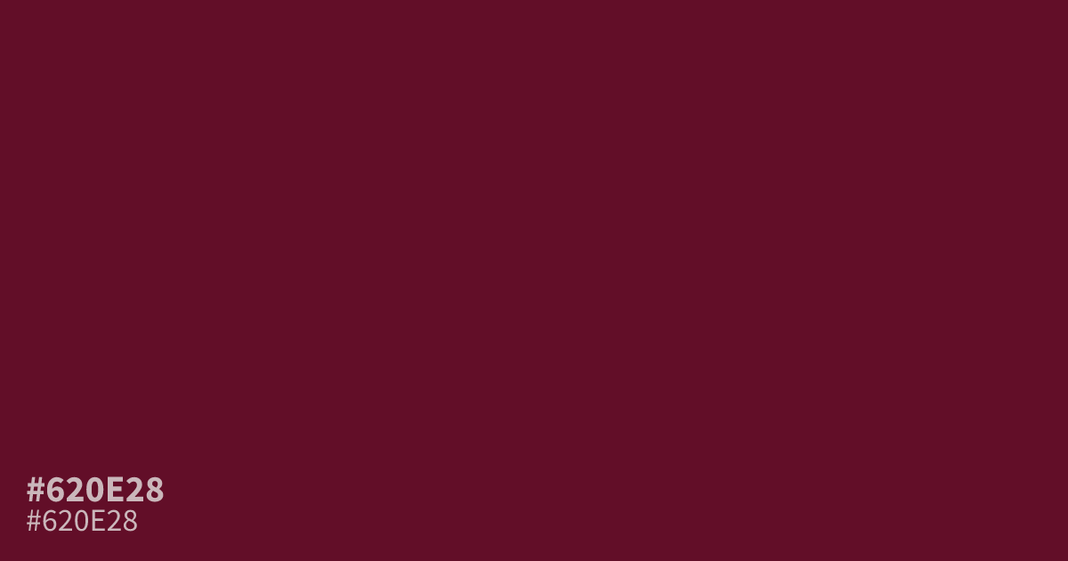
Dark and warm, #620e28 is a muted burgundy red with strong reddish-purple undertones. Its low lightness creates a serious, moody presence, while its rich saturation adds passion and energy. The hex code #620e28 works well as a dominant background or luxury accent, especially with warm cream. White text reads clearly against it at about a 13.0:1 contrast ratio, supporting accessible interface designs.
Questions about #620e28
What is #620e28 in RGB, HSL and CMYK?
In RGB, #620e28 is rgb(98, 14, 40), in HSL hsl(341, 75%, 22%) and in CMYK 0%, 86%, 59%, 62%. Browse more shades of pink with names and hex codes.
What colors pair well with #620e28?
#620e28 pairs well with warm cream, muted blush, and olive accents because their lighter or softened tones keep its dark red-purple base from feeling heavy in branding, editorial layouts, and seasonal packaging.
Is #620e28 suitable for white text?
Yes, #620e28 provides about a 13.0:1 contrast ratio with white, exceeding the WCAG AA 4.5:1 threshold for body text and making it suitable for readable buttons, navigation, headings, and other interface elements.
Is #620e28 readable on white or black?
#620e28 has a 13.02:1 contrast ratio on white and 1.61:1 on black. WCAG asks for 4.5:1 for body text and 3:1 for large text, so on white it works for body text and on black it is too faint for text. Try other pairs in the contrast checker.