
#610C81 Hex Color
Online color picker to view shades, tints, color codes, and complementary colors
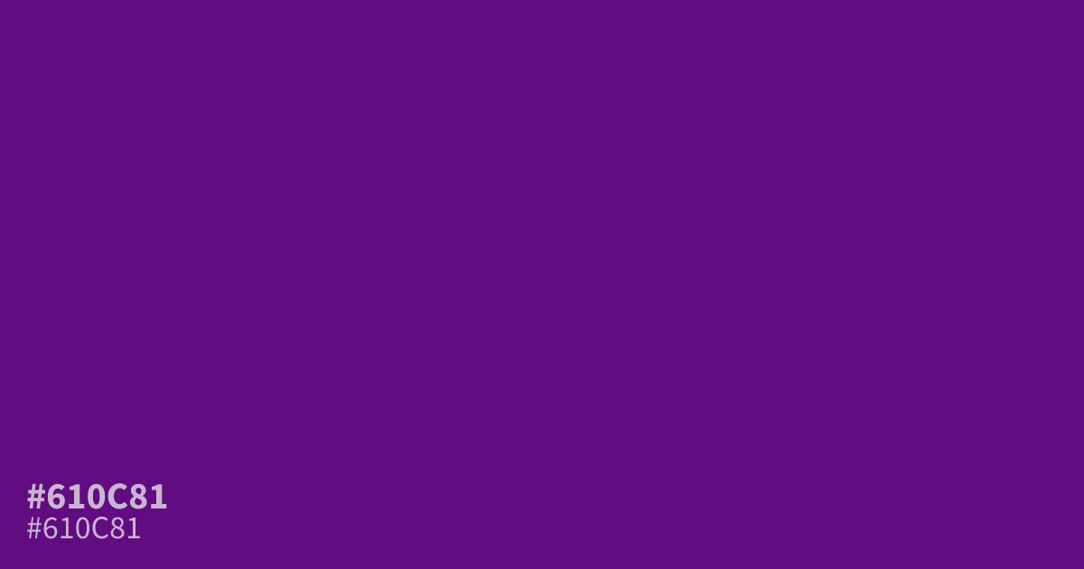
#610c81 sits in that dim, near-blackened zone of purple where color turns to mood. Deep and cool, it works best as a dominant base in dark mode interfaces or luxury branding, not as a small accent where its character gets lost. White text reads clearly against it at about 11.2:1, well past AA, and the hex code flatters muted gold.
Questions about #610c81
What is #610c81 in RGB, HSL and CMYK?
In RGB, #610c81 is rgb(97, 12, 129), in HSL hsl(284, 83%, 28%) and in CMYK 25%, 91%, 0%, 49%. Browse more shades of purple with names and hex codes.
What colors pair well with #610c81?
Muted gold and dusty plum bring out its luxury side, while sage green offsets its coolness. Avoid bright reds and oranges, which fight its depth.
Is #610c81 readable on white or black?
#610c81 has a 11.18:1 contrast ratio on white and 1.87:1 on black. WCAG asks for 4.5:1 for body text and 3:1 for large text, so on white it works for body text and on black it is too faint for text. Try other pairs in the contrast checker.