
#60316E Hex Color
Online color picker to view shades, tints, color codes, and complementary colors
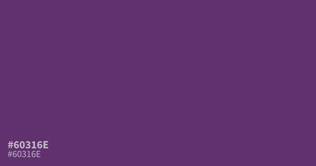
This dark, desaturated violet carries a heavy and somber presence. Because it sits on the cooler side of the spectrum, #60316e works best as a moody background or a grounding accent color. It provides excellent contrast for white text, making it a reliable choice for dark mode interfaces where readability is the priority. Use it sparingly to avoid overwhelming your layout.
Questions about #60316e
What is #60316e in RGB, HSL and CMYK?
In RGB, #60316e is rgb(96, 49, 110), in HSL hsl(286, 38%, 31%) and in CMYK 13%, 55%, 0%, 57%. Browse more shades of purple with names and hex codes.
Where should I use #60316e in my web design?
This dark violet excels as a moody background color for dark mode interfaces or as a heavy, grounding accent for buttons and borders. Because it is desaturated, it provides a stable, professional look that ensures white text remains highly legible against it.
Does #60316e lean cool or warm in a layout?
As a deep violet, #60316e carries cool, somber undertones that create a calming rather than energetic effect. It works best when you need to avoid the visual noise of brighter, warmer purples, making it a reliable choice for professional, wellness, or tech branding.
Is #60316e readable on white or black?
#60316e has a 9.71:1 contrast ratio on white and 2.16:1 on black. WCAG asks for 4.5:1 for body text and 3:1 for large text, so on white it works for body text and on black it is too faint for text. Try other pairs in the contrast checker.