
#5F568D Hex Color
Online color picker to view shades, tints, color codes, and complementary colors
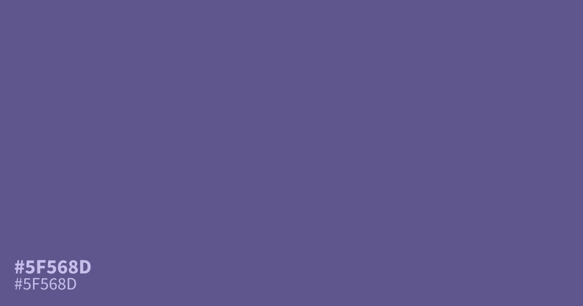
This dusty, muted violet brings a serious, grounded weight to any design. Because it lacks high saturation, #5f568d works best as a moody backdrop rather than a bright accent. It pairs well with soft creams or warm grays to avoid a muddy look. With a 6.6:1 contrast ratio against white, it remains readable for small text, making it a functional choice for dark mode UI interfaces.
Questions about #5f568d
What is #5f568d in RGB, HSL and CMYK?
In RGB, #5f568d is rgb(95, 86, 141), in HSL hsl(250, 24%, 45%) and in CMYK 33%, 39%, 0%, 45%. Browse more shades of purple with names and hex codes.
Why does #5f568d work well for dark mode interfaces?
This shade maintains a strong 6.6:1 contrast ratio against white text, ensuring excellent readability for smaller UI elements. Its desaturated, muted quality prevents the eye strain often associated with brighter or more vibrant purple hues in low-light environments.
What colors pair best with #5f568d?
The muted violet works best with soft creams or warm grays to avoid a muddy appearance. Using it alongside charcoal creates a sophisticated, grounded aesthetic, while pairing it with lighter neutrals helps preserve the color's serious, professional weight.
Is #5f568d readable on white or black?
#5f568d has a 6.55:1 contrast ratio on white and 3.20:1 on black. WCAG asks for 4.5:1 for body text and 3:1 for large text, so on white it works for body text and on black it works only for large text (24px, or 18.5px bold). Try other pairs in the contrast checker.