
#5E4061 Hex Color
Online color picker to view shades, tints, color codes, and complementary colors
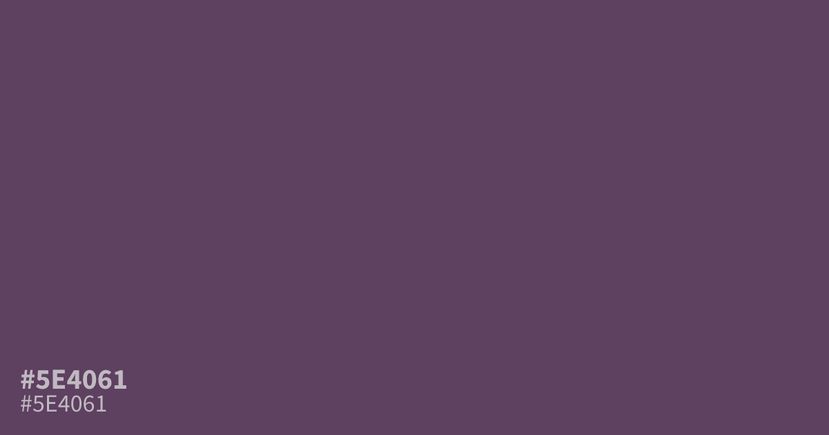
Close to the color of a dried plum, this purple is dark and heavily grayed. #5e4061 works best as a supporting tone or dark background, where white text reads clearly at about 8.8:1 contrast. Its muted violet undertone leans somber rather than playful, so it flatters warm golds and dusty pinks, which keep it from turning muddy.
Questions about #5e4061
What is #5e4061 in RGB, HSL and CMYK?
In RGB, #5e4061 is rgb(94, 64, 97), in HSL hsl(295, 20%, 32%) and in CMYK 3%, 34%, 0%, 62%. Browse more shades of purple with names and hex codes.
What colors pair well with #5e4061?
Warm golds, dusty rose, and soft cream all sit well against #5e4061, since their warmth offsets its grayed violet tone. For text and icons, white or near-white gives the clearest contrast.
Is #5e4061 good as a background color?
Yes. Its low lightness makes it a solid dark mode or moody layout background, and white text on it reaches about 8.8:1 contrast, well past WCAG AA for body text. Fine detail in dark tones can get lost, so keep small elements lighter.
Is #5e4061 readable on white or black?
#5e4061 has a 8.81:1 contrast ratio on white and 2.38:1 on black. WCAG asks for 4.5:1 for body text and 3:1 for large text, so on white it works for body text and on black it is too faint for text. Try other pairs in the contrast checker.