
#5C4E6F Hex Color
Online color picker to view shades, tints, color codes, and complementary colors
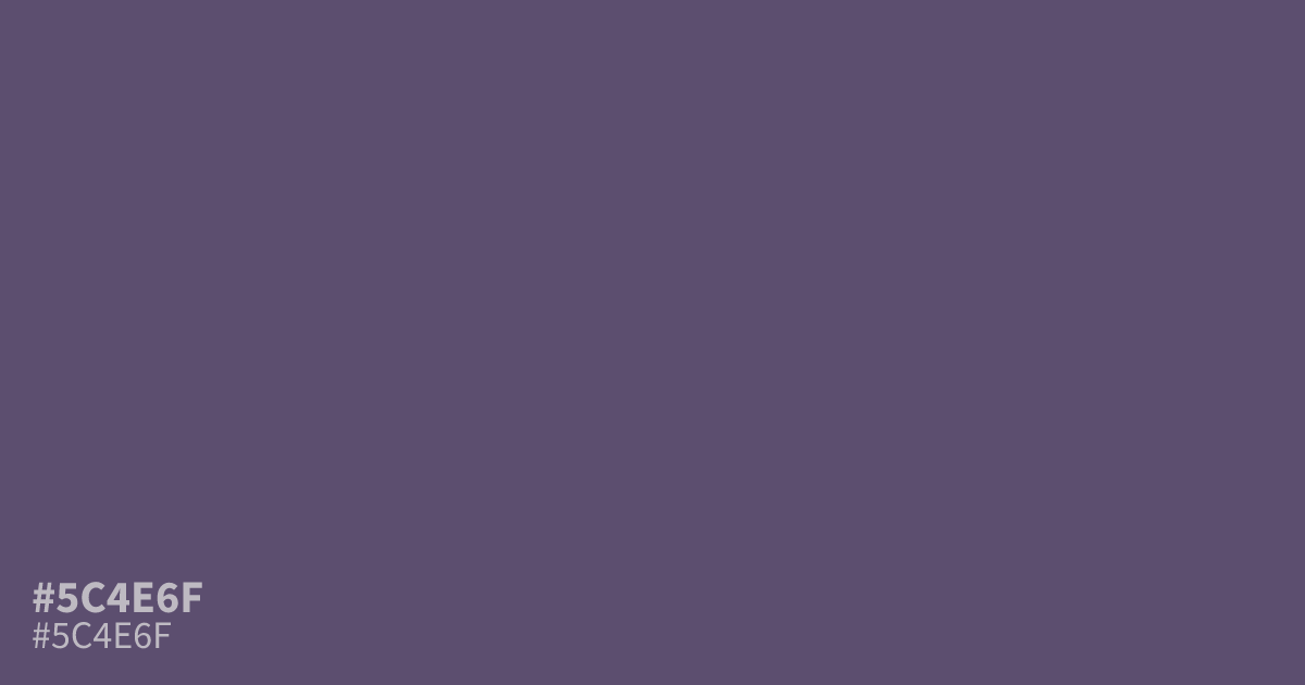
This dusty, muted violet reads as a serious and grounded mid-tone. Because it lacks high saturation, #5c4e6f works well as a background for dark mode interfaces or moody, structured branding. Pair this hex code with warm creams or off-whites to prevent it from looking too flat. It offers enough contrast for readable text, making it a reliable choice for professional, academic, or spiritual design contexts.
Questions about #5c4e6f
What is #5c4e6f in RGB, HSL and CMYK?
In RGB, #5c4e6f is rgb(92, 78, 111), in HSL hsl(265, 17%, 37%) and in CMYK 17%, 30%, 0%, 56%. Browse more shades of purple with names and hex codes.
What colors pair well with #5c4e6f in a design?
Pair #5c4e6f with warm creams or soft off-whites to prevent the design from appearing too flat or muddy. Using lighter neutral tones helps lift the violet hue, adding needed contrast for better readability in UI and web design layouts.
Is #5c4e6f a good choice for text on a white background?
Using #5c4e6f as text on standard white might fail strict accessibility standards due to insufficient contrast ratios. It is much more effective when utilized as a dark background color for light-colored text or as a muted accent for interface elements.
Is #5c4e6f readable on white or black?
#5c4e6f has a 7.56:1 contrast ratio on white and 2.77:1 on black. WCAG asks for 4.5:1 for body text and 3:1 for large text, so on white it works for body text and on black it is too faint for text. Try other pairs in the contrast checker.