
#5B3CB3 Hex Color
Online color picker to view shades, tints, color codes, and complementary colors
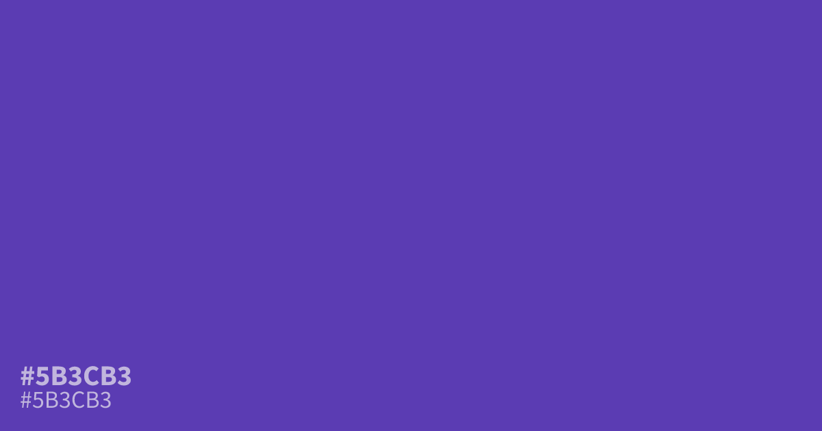
This intense, vivid violet demands attention. Because #5b3cb3 carries such high saturation, it works best as a bold accent color rather than a large background. It pairs exceptionally well with muted mint greens for a striking, modern contrast. For accessibility, white text stands out clearly against this shade, meeting WCAG AA standards easily for readability in UI designs.
Questions about #5b3cb3
What is #5b3cb3 in RGB, HSL and CMYK?
In RGB, #5b3cb3 is rgb(91, 60, 179), in HSL hsl(256, 50%, 47%) and in CMYK 49%, 66%, 0%, 30%. Browse more shades of purple with names and hex codes.
How should I use #5b3cb3 in a UI design?
#5b3cb3 functions most effectively as a high-impact accent color rather than a large background fill. Its strong saturation draws the eye immediately, so apply it to call-to-action buttons or navigation highlights where you need to guide user attention successfully.
What colors pair well with #5b3cb3?
Is #5b3cb3 readable on white or black?
#5b3cb3 has a 7.65:1 contrast ratio on white and 2.74:1 on black. WCAG asks for 4.5:1 for body text and 3:1 for large text, so on white it works for body text and on black it is too faint for text. Try other pairs in the contrast checker.