
#581C61 Hex Color
Online color picker to view shades, tints, color codes, and complementary colors
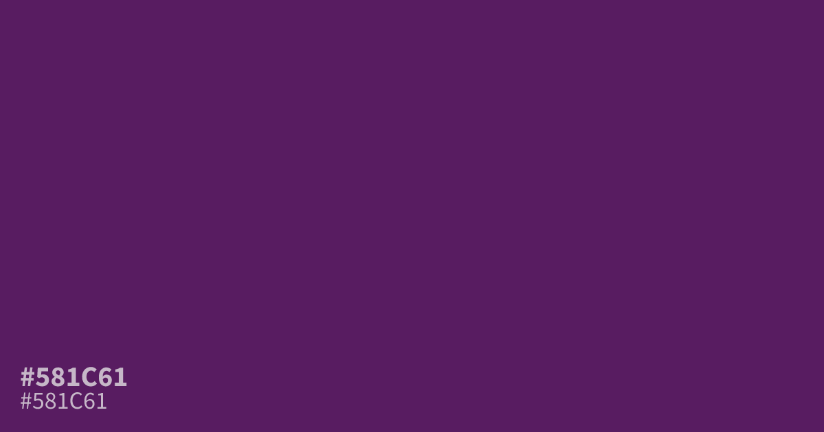
Reach for #581c61 when a design needs a dark purple that carries weight without going black. This deep, muted violet works best as a dominant base in dark mode layouts, moody brand palettes, or luxury packaging. White text reads clearly against it at roughly 12:1 contrast, so small body copy stays legible. Its grayed undertone reads cool and serious, and a warm gold accent keeps it from feeling flat.
Questions about #581c61
What is #581c61 in RGB, HSL and CMYK?
In RGB, #581c61 is rgb(88, 28, 97), in HSL hsl(292, 55%, 25%) and in CMYK 9%, 71%, 0%, 62%. Browse more shades of purple with names and hex codes.
What colors pair well with #581c61?
Warm golds and brassy tones flatter #581c61 best because they counter its cool, grayed base, while dusty mauve or muted plum work as quieter supporting tones. Avoid stacking it against other dark purples, as the combination turns muddy.
Is #581c61 a warm or cool color?
#581c61 reads cool overall. The red in its base adds a trace of warmth, but its low lightness and muted saturation keep the mood cold, serious, and somber.
Is #581c61 readable on white or black?
#581c61 has a 11.97:1 contrast ratio on white and 1.75:1 on black. WCAG asks for 4.5:1 for body text and 3:1 for large text, so on white it works for body text and on black it is too faint for text. Try other pairs in the contrast checker.