
#551B67 Hex Color
Online color picker to view shades, tints, color codes, and complementary colors
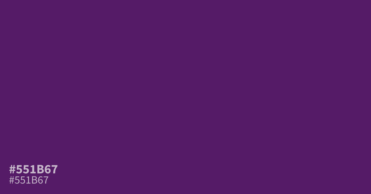
#551b67 is a deep, dim purple that suits dark mode layouts, luxury branding, and moody gradient work. Its low lightness gives strong contrast behind white text, though it can read muddy as a full background next to brighter shades. Pair it with soft golds or muted mauve for balance.
Questions about #551b67
What is #551b67 in RGB, HSL and CMYK?
In RGB, #551b67 is rgb(85, 27, 103), in HSL hsl(286, 58%, 25%) and in CMYK 17%, 74%, 0%, 60%. Browse more shades of purple with names and hex codes.
What colors pair well with #551b67?
Soft golds, muted mauves, and pale lavenders all flatter this deep purple. Warm metallics add a luxury feel, while off-whites keep it readable as a background.
Is #551b67 a good color for text backgrounds?
Yes. Its low lightness gives white text strong contrast, which meets accessibility standards for body copy. Avoid placing mid-tone purples on top of it, since they lose separation.
Is #551b67 readable on white or black?
#551b67 has a 12.07:1 contrast ratio on white and 1.73:1 on black. WCAG asks for 4.5:1 for body text and 3:1 for large text, so on white it works for body text and on black it is too faint for text. Try other pairs in the contrast checker.