
#54012E Hex Color
Moody wine pink with deep warmth
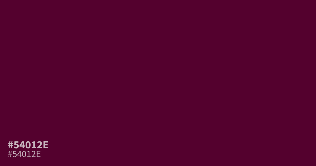
Dark and intensely saturated, #54012e is a warm pink with wine-red undertones and a gloomy, mysterious mood. Its depth suits romance, cosmetics, fashion, and moody branding, especially as a supporting tone or small accent beside blush, cream, or muted gold. White text reads clearly on it, making the hex code practical for dark UI panels and bold headings.
Questions about #54012e
What is #54012e in RGB, HSL and CMYK?
In RGB, #54012e is rgb(84, 1, 46), in HSL hsl(327, 98%, 17%) and in CMYK 0%, 99%, 45%, 67%. Browse more shades of pink with names and hex codes.
What colors pair well with #54012e?
Pair #54012e with blush, cream, muted gold, or charcoal to balance its dark wine-pink depth. Blush softens its romantic mood, cream adds brightness, and muted gold brings warmth without competing with the saturated base.
Is #54012e warm or cool?
#54012e reads as a warm, wine-leaning pink because its hue favors magenta-red over blue-purple, giving designs a romantic, dramatic, and slightly mysterious mood. It works best as a dark accent, headline color, or background panel rather than a large, bright field.
Does white text work well on #54012e?
White text provides strong contrast on #54012e and suits headings or dark UI panels, while black text does not provide enough contrast for accessible body text at normal sizes, so verify any cream or pastel pairing before use.
Is #54012e readable on white or black?
#54012e has a 14.78:1 contrast ratio on white and 1.42:1 on black. WCAG asks for 4.5:1 for body text and 3:1 for large text, so on white it works for body text and on black it is too faint for text. Try other pairs in the contrast checker.