
#532F71 Hex Color
Online color picker to view shades, tints, color codes, and complementary colors
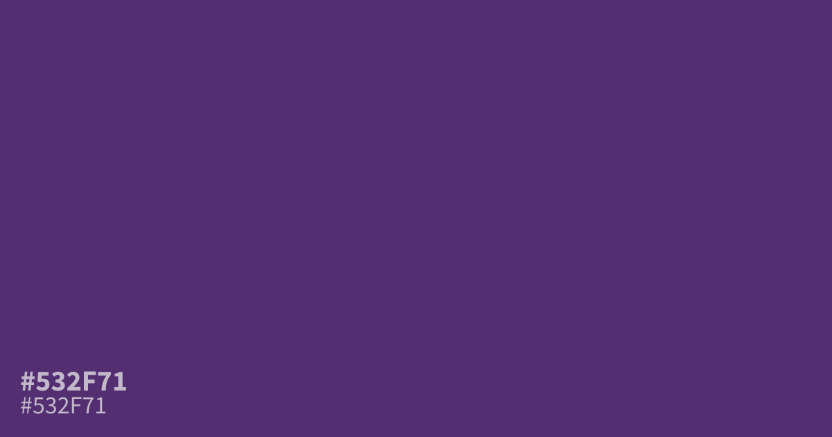
A dark and serious violet, #532f71 brings a moody atmosphere to digital interfaces. Its deep saturation works effectively as a full-page background, where white text remains highly readable with a 10.4:1 contrast ratio. Designers often use this hex code to create depth in luxury branding or dark mode themes. Pair it with soft, muted metallics to balance its heavy, shadowy character.
Questions about #532f71
What is #532f71 in RGB, HSL and CMYK?
In RGB, #532f71 is rgb(83, 47, 113), in HSL hsl(273, 41%, 31%) and in CMYK 27%, 58%, 0%, 56%. Browse more shades of purple with names and hex codes.
Does #532f71 work well for UI text?
This deep violet works exceptionally well as a dark mode background color because its high contrast ratio allows standard white text to remain perfectly legible. Avoid using #532f71 for small body text, as its extreme darkness can make fine typography difficult to read on many digital displays.
What colors pair best with #532f71?
Pair #532f71 with muted metallics or soft creams to balance its intense, shadowy character without clashing. Using a cool slate or a soft white allows this deep violet to act as a grounded anchor for more vibrant brand accents.
Is #532f71 readable on white or black?
#532f71 has a 10.43:1 contrast ratio on white and 2.01:1 on black. WCAG asks for 4.5:1 for body text and 3:1 for large text, so on white it works for body text and on black it is too faint for text. Try other pairs in the contrast checker.