
#470021 Hex Color
Online color picker to view shades, tints, color codes, and complementary colors
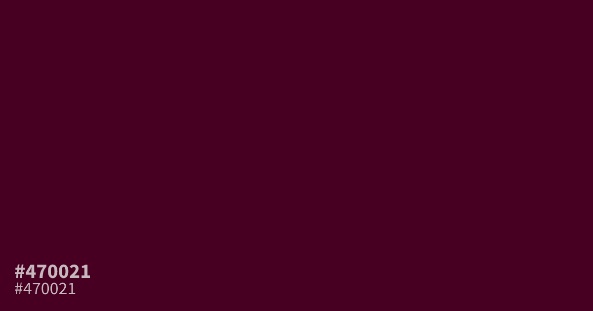
This deep, unsaturated wine tone carries a moody and serious weight. Because #470021 is very dark, it serves best as a moody background or a subtle accent rather than a primary interface color. It pairs surprisingly well with muted gold or soft cream, which pop against its heavy, dim character. The hex code for this shade is #470021, and white text remains highly legible against its dark surface.
Questions about #470021
What is #470021 in RGB, HSL and CMYK?
In RGB, #470021 is rgb(71, 0, 33), in HSL hsl(332, 100%, 14%) and in CMYK 0%, 100%, 54%, 72%. Browse more shades of pink with names and hex codes.
What colors pair best with #470021 for a balanced design?
#470021 works best when contrasted with lighter, neutral tones that prevent it from feeling too heavy. Pair it with soft cream or muted gold to make the color pop while maintaining a sophisticated, high-end look for your digital interface.
Is #470021 suitable for long-form text on websites?
While #470021 offers excellent legibility against white backgrounds, it is usually better suited for headers or graphic accents rather than body text. Because it is so dark and saturated, using it for long paragraphs often leads to increased eye strain.
Is #470021 readable on white or black?
#470021 has a 16.28:1 contrast ratio on white and 1.28:1 on black. WCAG asks for 4.5:1 for body text and 3:1 for large text, so on white it works for body text and on black it is too faint for text. Try other pairs in the contrast checker.