
#462047 Hex Color
A serious and grounded dark violet
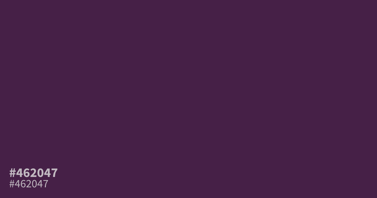
This dark, unsaturated violet reads as serious and grounded, avoiding the typical brightness of purple. Because of its deep tone, #462047 acts as a strong, moody background for UI or branding. It provides excellent contrast for white text, ensuring readability. Pair it with soft, muted golds or pale grays to keep your palette from becoming too heavy or muddy in large applications.
Questions about #462047
What is #462047 in RGB, HSL and CMYK?
In RGB, #462047 is rgb(70, 32, 71), in HSL hsl(298, 38%, 20%) and in CMYK 1%, 55%, 0%, 72%. Browse more shades of purple with names and hex codes.
What colors pair best with #462047 for a balanced design?
Soft muted golds and pale grays provide the best balance for #462047 because they lift its heavy, dark tone without introducing chaotic contrast. These pairings create a professional, grounded aesthetic that remains readable on digital screens and printed materials.
Is #462047 a good choice for UI backgrounds?
#462047 serves as an excellent, sophisticated background for UI designs when paired with high-contrast white text. Its unsaturated, dark nature avoids the visual strain of brighter, more saturated purples while maintaining a modern, serious look for high-end digital branding.
Is #462047 readable on white or black?
#462047 has a 13.47:1 contrast ratio on white and 1.55:1 on black. WCAG asks for 4.5:1 for body text and 3:1 for large text, so on white it works for body text and on black it is too faint for text. Try other pairs in the contrast checker.