
#44246C Hex Color
A deep moody purple with shadowy intensity
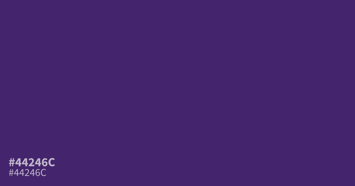
This dark, moody purple carries a dense, shadowy quality that excels as a full-page background. Because of its intense saturation, #44246c works best when paired with stark white text for high-contrast accessibility. Avoid using it for fine detail work where it can quickly appear muddy. For a modern, balanced palette, try using this hex code alongside soft, warm metallics like brushed gold.
Questions about #44246c
What is #44246c in RGB, HSL and CMYK?
In RGB, #44246c is rgb(68, 36, 108), in HSL hsl(267, 50%, 28%) and in CMYK 37%, 67%, 0%, 58%. Browse more shades of purple with names and hex codes.
What colors pair well with the dark purple of #44246c?
Soft, warm metallics like brushed gold provide a balanced, sophisticated contrast against the dense, shadowy nature of #44246c. You can also ground the intensity by pairing it with neutral, cool-toned slate or crisp whites to ensure readability.
Is #44246c suitable for text-heavy web designs?
Due to its deep saturation, #44246c is best utilized as a bold, moody background color rather than for fine text. If you must use it for type, ensure the font weight is heavy and the color is set against a very light background for necessary contrast.
Is #44246c readable on white or black?
#44246c has a 12.24:1 contrast ratio on white and 1.71:1 on black. WCAG asks for 4.5:1 for body text and 3:1 for large text, so on white it works for body text and on black it is too faint for text. Try other pairs in the contrast checker.