
#435C9E Hex Color
Online color picker to view shades, tints, color codes, and complementary colors
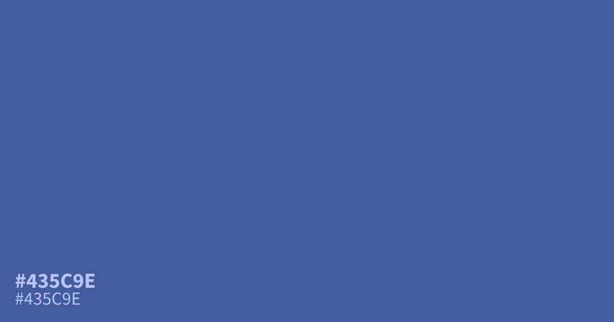
This muted, dusty blue feels restrained and serious. Because #435c9e is quite unsaturated and dark, it works best as a secondary UI element or a grounded background rather than a bold focal point. It pairs surprisingly well with warm terracotta accents, which cut through its inherent coolness. White text remains perfectly legible against this shade, meeting WCAG standards for high-contrast accessibility.
Questions about #435c9e
What is #435c9e in RGB, HSL and CMYK?
In RGB, #435c9e is rgb(67, 92, 158), in HSL hsl(224, 40%, 44%) and in CMYK 58%, 42%, 0%, 38%. Browse more shades of blue with names and hex codes.
What colors pair well with the #435c9e hex color?
#435c9e works best when contrasted against warm, earthy tones to balance its natural coolness. Try pairing it with terracotta or soft cream to create visual interest while maintaining a professional, grounded atmosphere in your interface designs.
Is #435c9e a good choice for text backgrounds?
Yes, #435c9e is an excellent choice for background elements because it provides enough depth to support white text while meeting standard high-contrast accessibility guidelines. It remains legible on screens without overwhelming the user like a brighter, more saturated blue might.
Is #435c9e readable on white or black?
#435c9e has a 6.43:1 contrast ratio on white and 3.26:1 on black. WCAG asks for 4.5:1 for body text and 3:1 for large text, so on white it works for body text and on black it works only for large text (24px, or 18.5px bold). Try other pairs in the contrast checker.